Employes
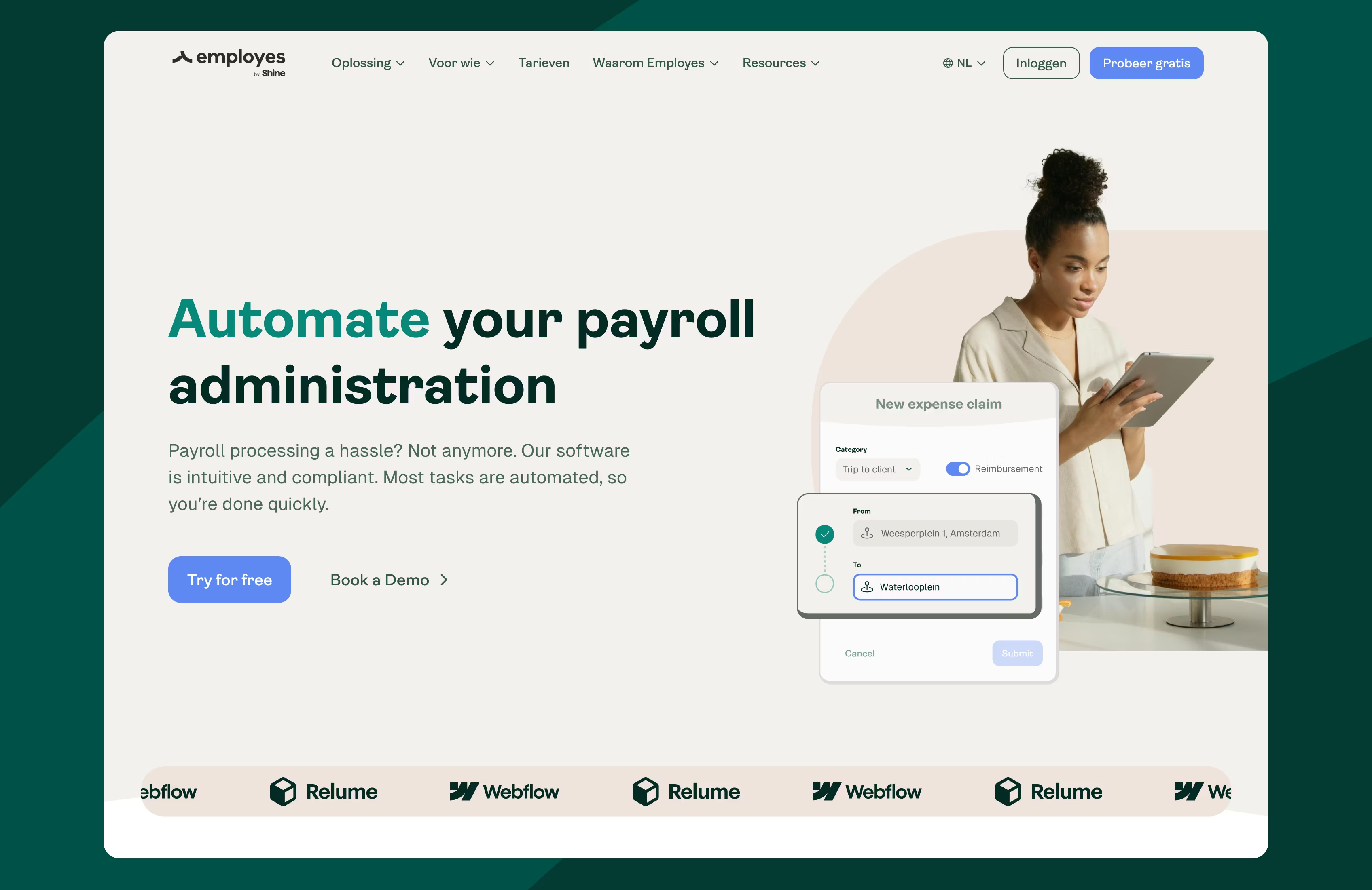
As Employes grew into a scale-up, they asked us to translate their refreshed brand into a modular website. We created a scalable, flexible platform with a UI audit, multilingual setup, and content tools to support their next phase of growth.
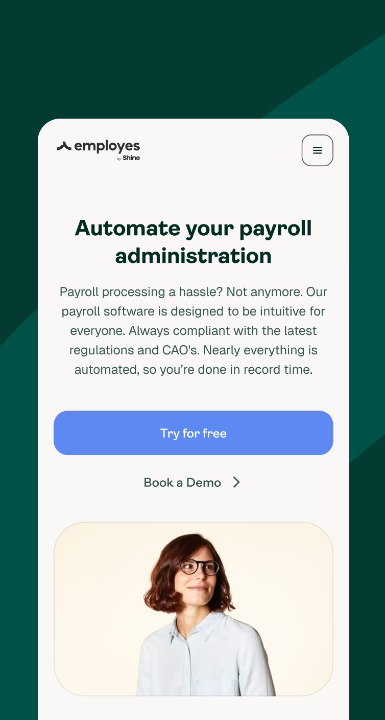
We rebuilt their marketing foundation and visual system. We translated the new identity into a modular web design and component library and delivered a flexible, multilingual marketing website built on Prismic, a CMS that enables their team to publish pages in minutes.
What we worked on
- Conversion optimization
- Website Design
- Website Development
- Animations & Interactions
Tech stack
- Next.js
- Tailwind
- Prismic
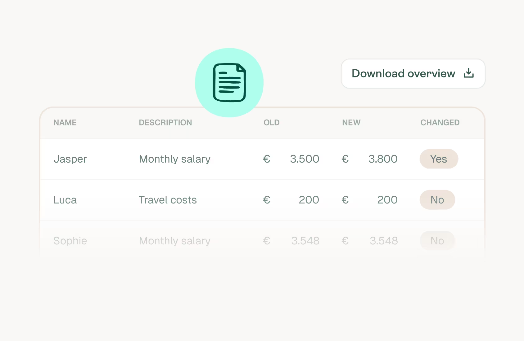
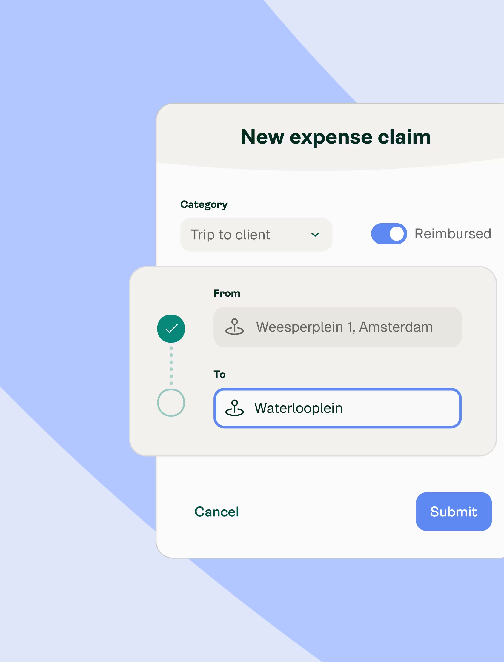
Translating brand into a cohesive web experience
Before design work began, we joined brand sessions led by the external brand agency Employes worked with to ensure the identity would translate effectively into digital environments.
We aligned on typography, color, spacing and interaction patterns, then developed a web focused style direction that set clear rules for UI behavior, motion and imagery. This created a foundation that connected the marketing website and parts of the product into one consistent system.
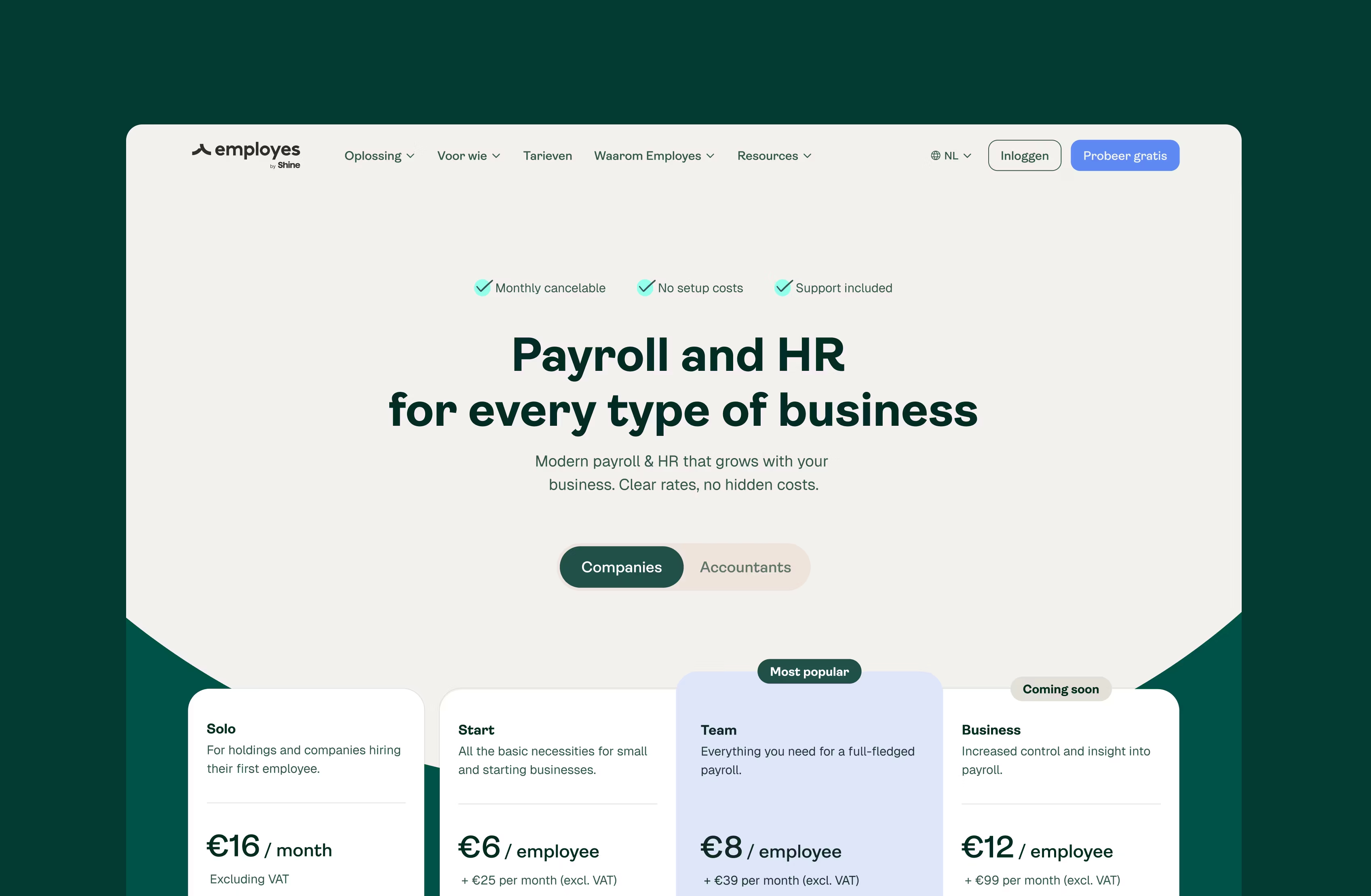
Design and development working in parallel
Design and development progressed in parallel. Their developers received early access to concepts and components, which streamlined collaboration and reduced handover friction. We structured the interface using atomic design so each element mapped directly to Prismic slices. This gave marketing predictable building blocks and provided their development team with a system that could evolve without compromising consistency.


Technical approach
We worked with Next.js, TypeScript, Prismic as the CMS, Tailwind and GSAP, guided by the goals of the project. The CMS was configured so the marketing team could assemble complete pages through dynamic sections rather than rely on fixed templates.
Motion was added to strengthen brand expression while staying within performance targets. SEO, multi language support and HubSpot integration were included from the outset, ensuring campaigns and market expansion could be executed without additional technical work.
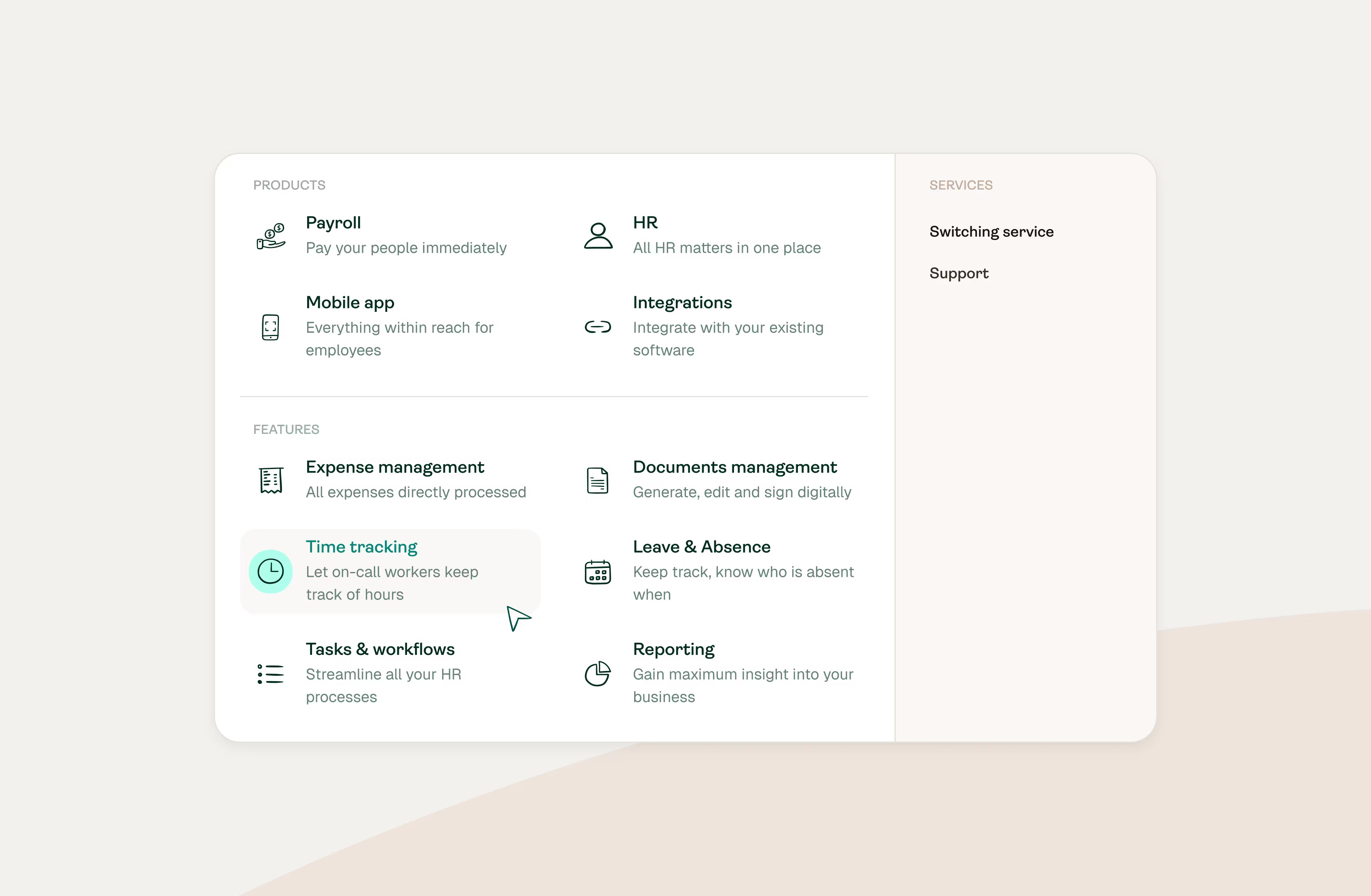
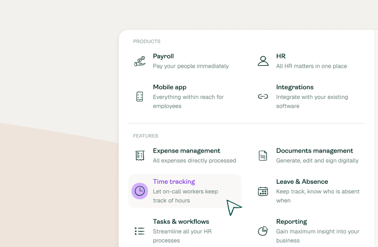
Bridging the gap between brand and product
Employes’ in-house design team expressed the need for their product to match the confidence of their new identity. Although we had made progress on the website design, turning a brand identity into a platform UI, as always, required experience, expertise and would took account an interface, which in nature is more functional and utilitatian than a marketing website .
To help them bridge that gap we conducted a UI audit and a whipped up a clear style direction that translated the brand into real, scalable interface patterns.
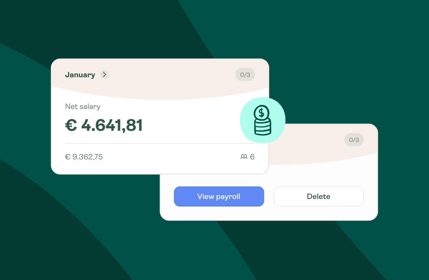
We refined spacing, typography, color use, and interaction rules so their team has a visual language they could grow with and would help them make the marketing expressions and their platform feel seamlessly connected.
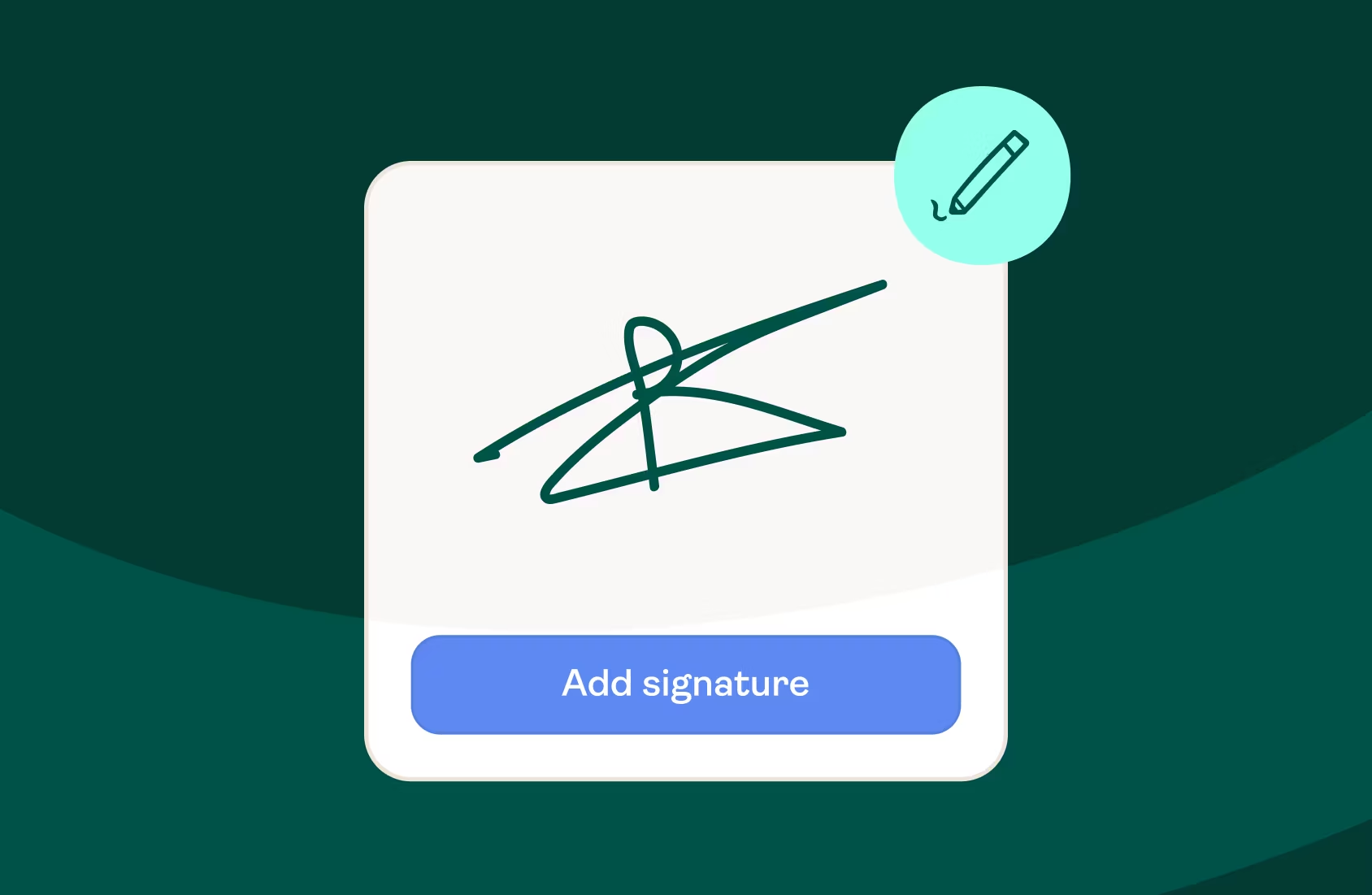
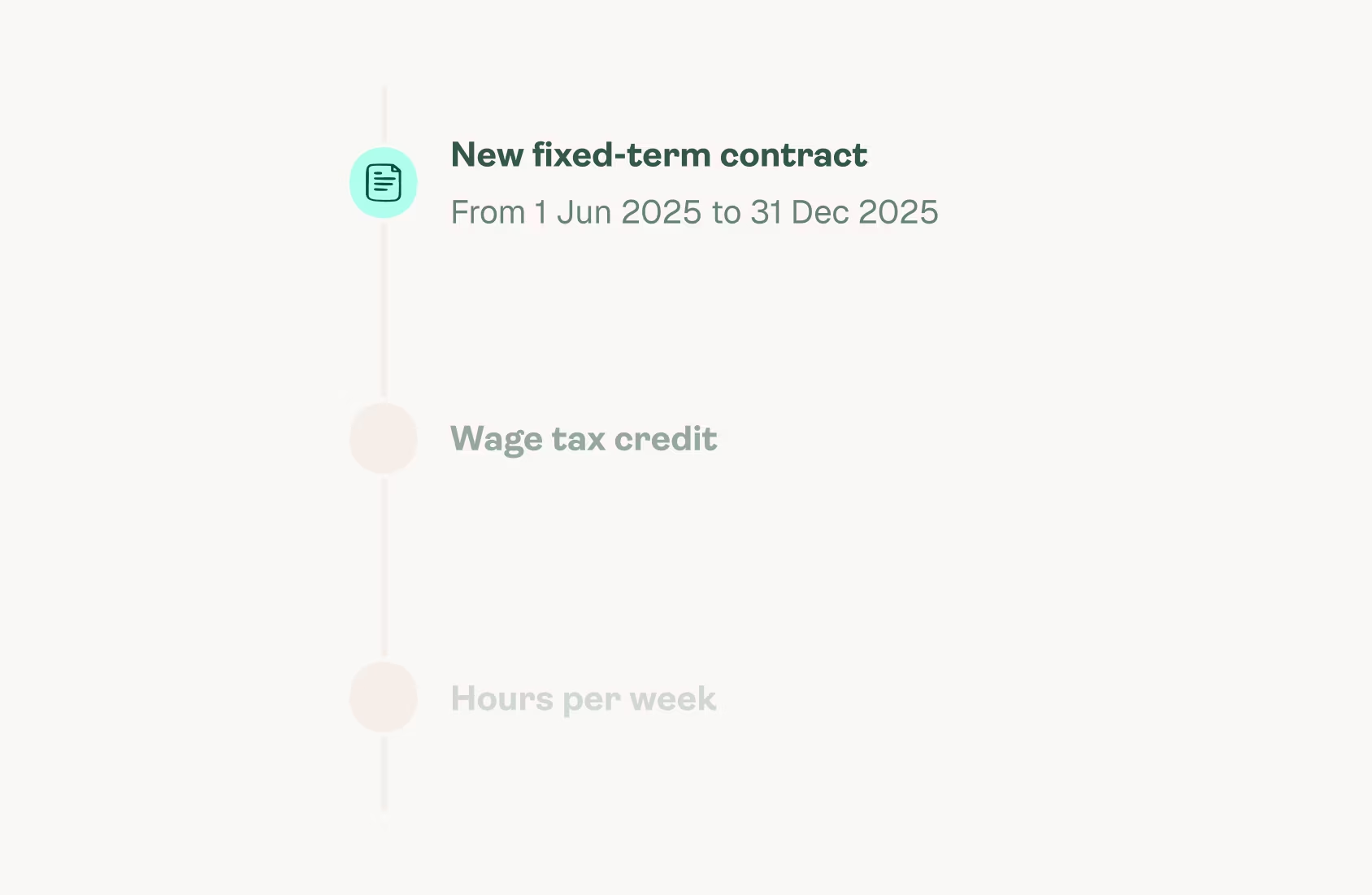
Results that support their next stage of growth
Employes now has a marketing website and visual foundation aligned with the company’s next stage of growth. The experience conveys maturity and supports conversations with larger customers. Marketing can work independently through the structured and easy to use CMS, creating content, campaigns and pages without developer support. Their product team builds on a clear visual language and component library that keeps brand, marketing website and product aligned as they continue to expand.
Conversion uplift
Faster page production
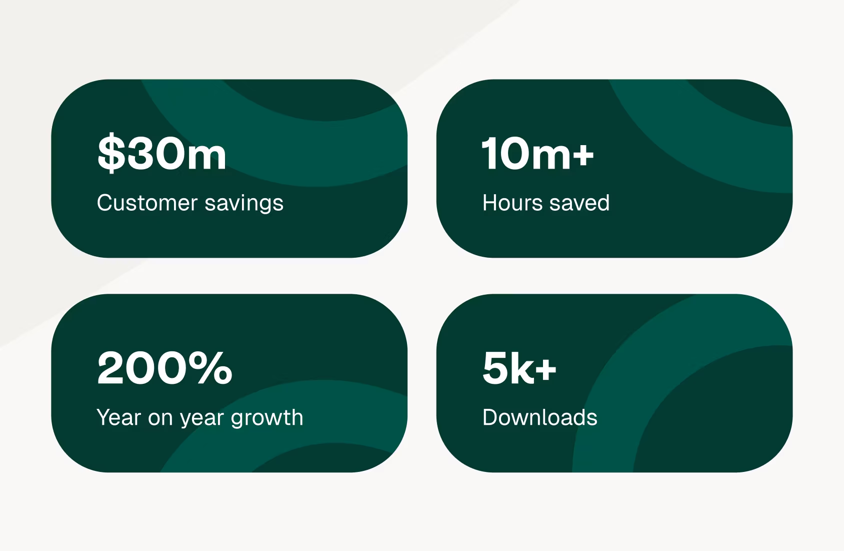
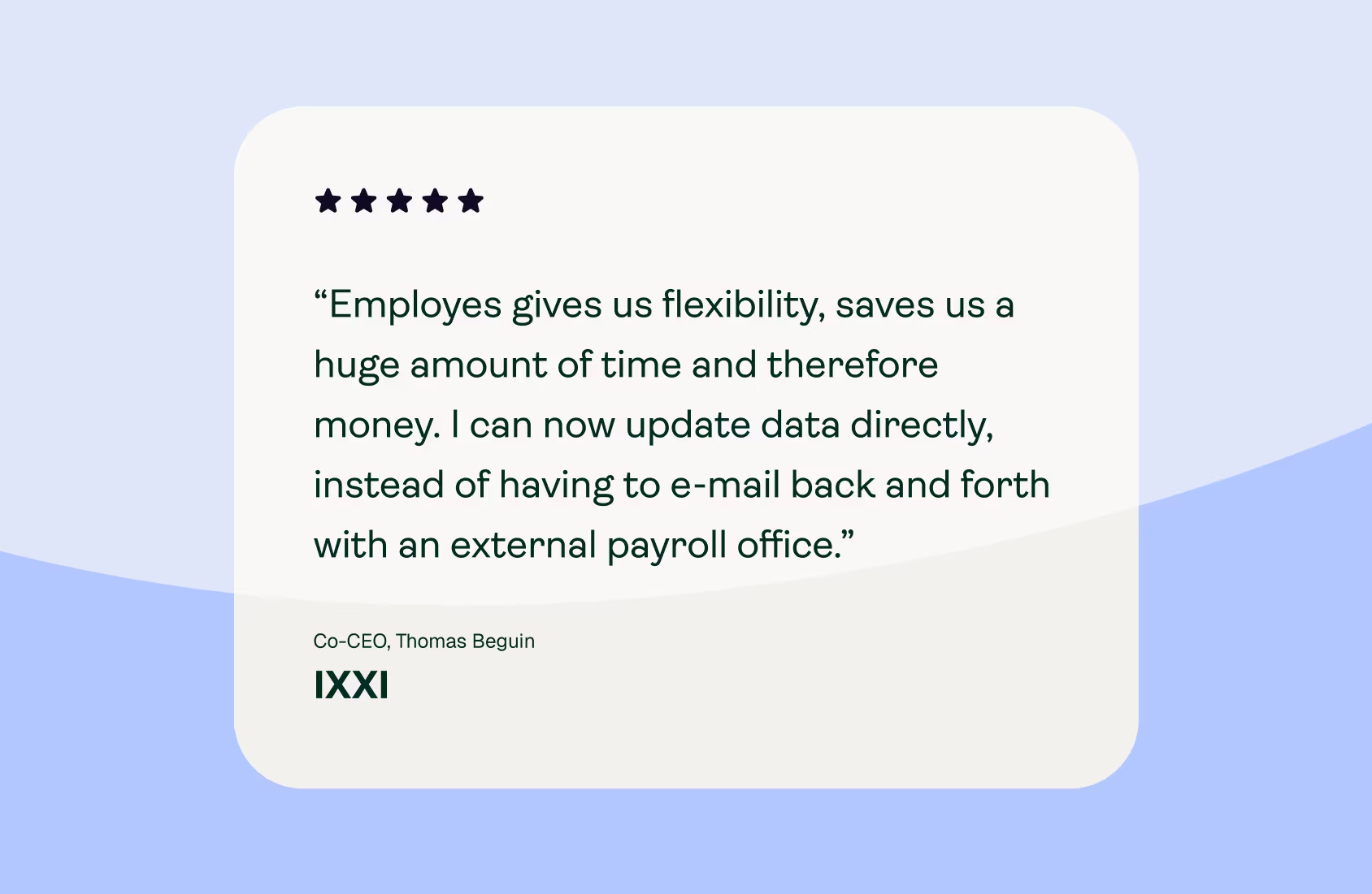

We needed a website that attracted bigger clients and reflected our growth. Yummygum delivered a structured, high-quality process. The first design version was spot on, and communication was seamless. Now, we have a professional website that builds trust and is easy for our marketing team to manage —giving them time to focus on growth .

