Vio.com
Findhotel rebranded as Vio.com to reposition the company. Their former branding was easily forgettable, and the new name demanded a fresh identity with more trust and international appeal, without disrupting a familiar, high-stakes platform experience.
We worked together on a brand foundation that could carry Vio.com into a crowded travel market and a practical system to translate it consistently into product and marketing. We started with UX/UI and accessibility audits to establish what to improve and what to protect. With brand strategy, creative direction, and brand identity guidelines in place, they’re now able to roll out Vio.com consistently while keeping the platform familiar and conversion-focused for millions of users.
What we worked on
- Brand Strategy
- Creative Direction
- Information Architecture
- UX/UI Design
- Product Design
- Website Design
- Graphics & Illustrations
- Interaction Design
- Brand Identity Guidelines
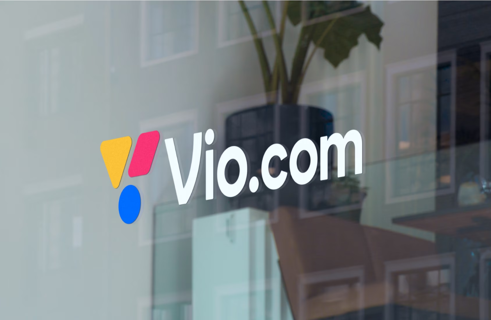
Vio.com (formerly Findhotel) is an Online Travel Agency platform that aggregates prices from major travel sites so travelers can compare options fast and book with confidence. They operate in a category dominated by massive brands, where trust, clarity, and recognition decide whether users stay, click out, or convert.

Strategy before concepting
We started by aligning the Vio.com leadership team in a brand strategy workshop, clarifying positioning, audience signals, and what the rebrand needed to achieve.
From that foundation, we developed three distinct brand concepts to explore different ways Vio.com could show up in the travel market. Together, we tested each direction against real product contexts and chose the concept that best balanced distinctiveness with familiarity.

From a name change to a scalable brand system
A rename only works if the experience around it changes too. We designed the Vio.com identity to solve two business problems at once: increase recognition in a sea of similar travel brands, and ensure the brand can be applied consistently without slowing teams down.
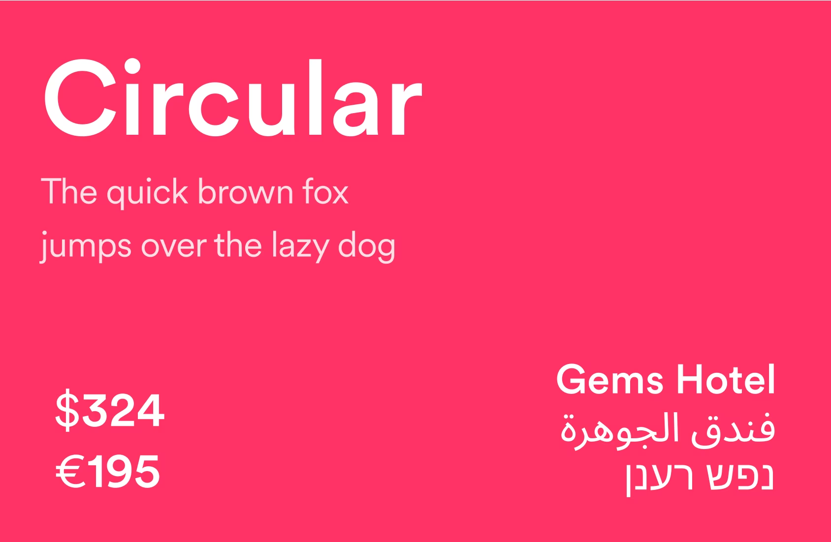
Instead of delivering a brand book full of abstract rules, we built practical guidelines with real examples. How the brand behaves in UI components, how it shows up in campaigns, how it scales across placements and screen sizes, and how the system stays accessible while still feeling distinctive.

Identity decisions driven by usability and recognition
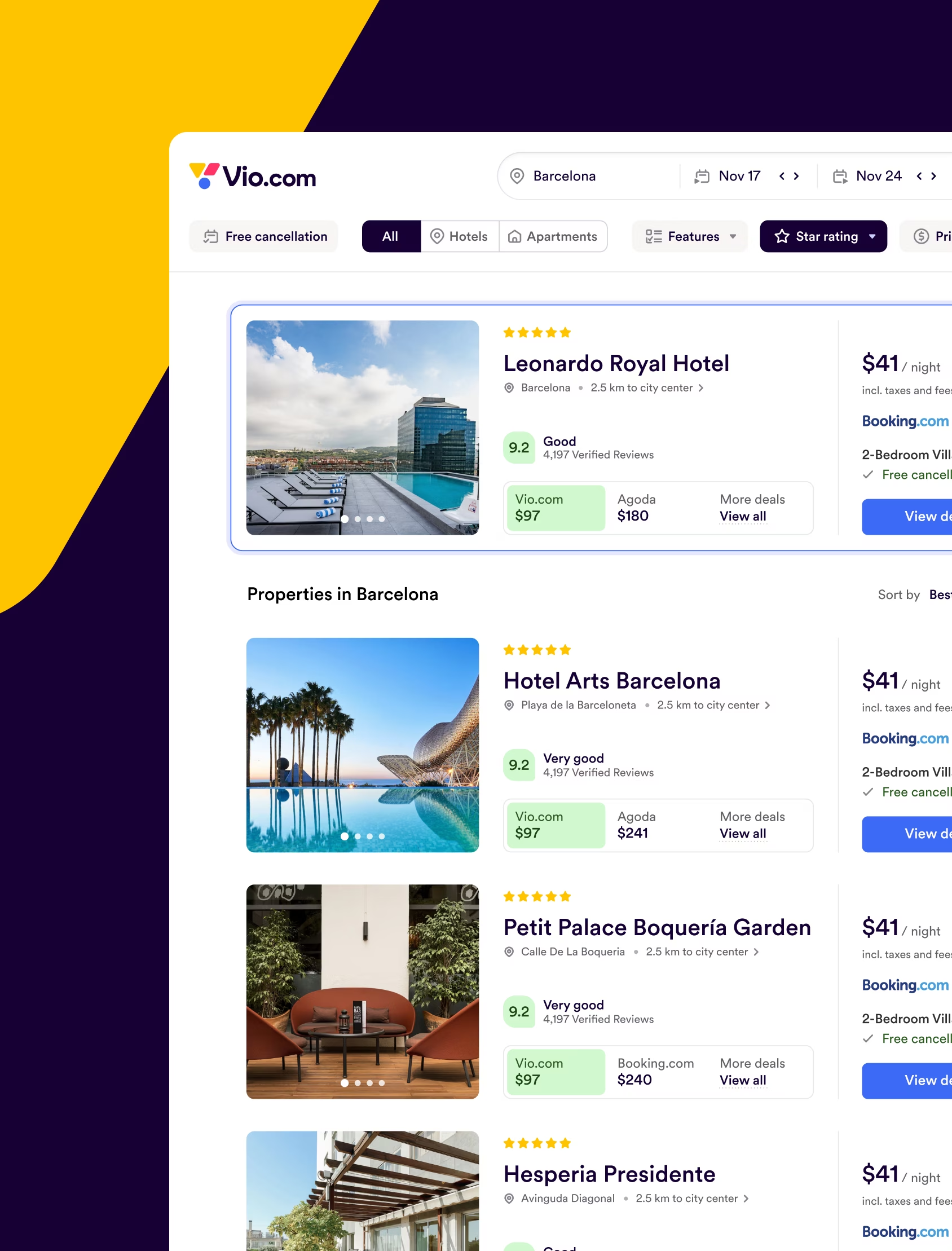
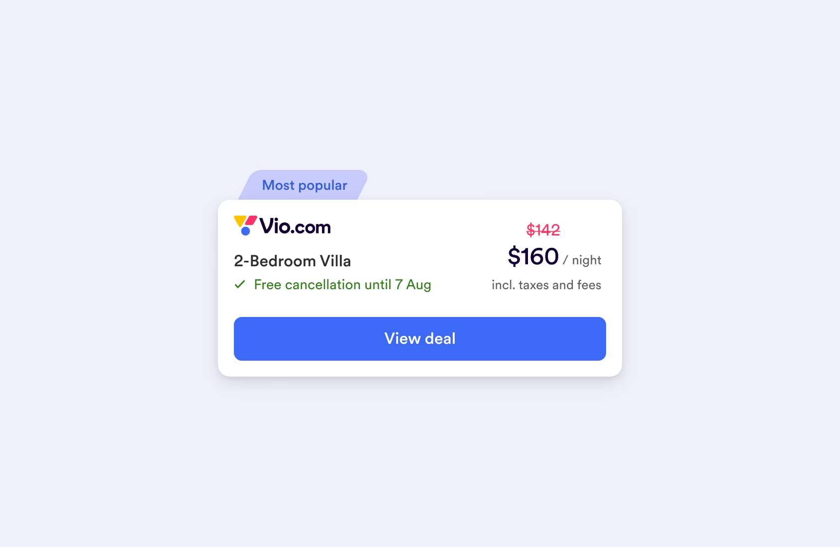
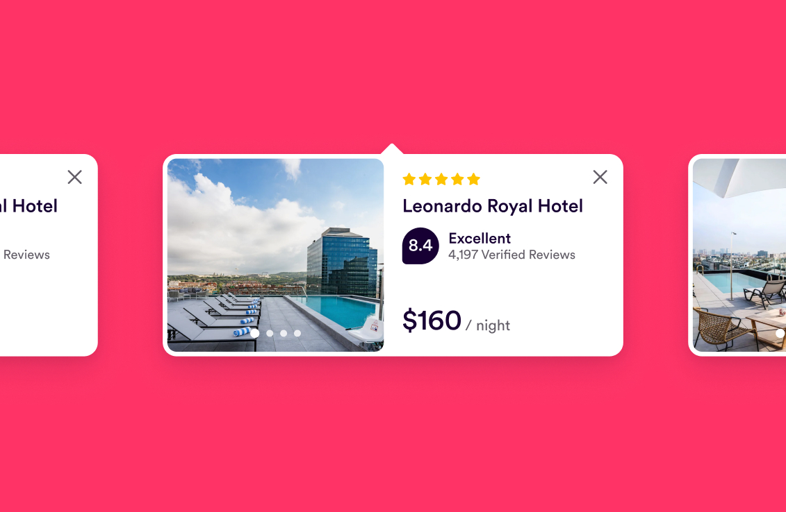
Many travel experiences are won in small moments: a search result, a listing, a comparison view, a retargeting ad. So the Vio.com identity had to work in high-density interfaces and tiny placements.
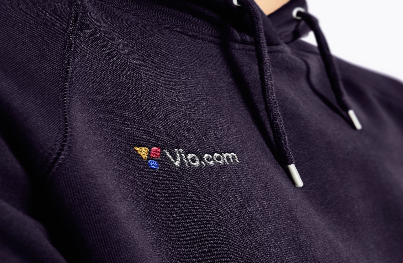
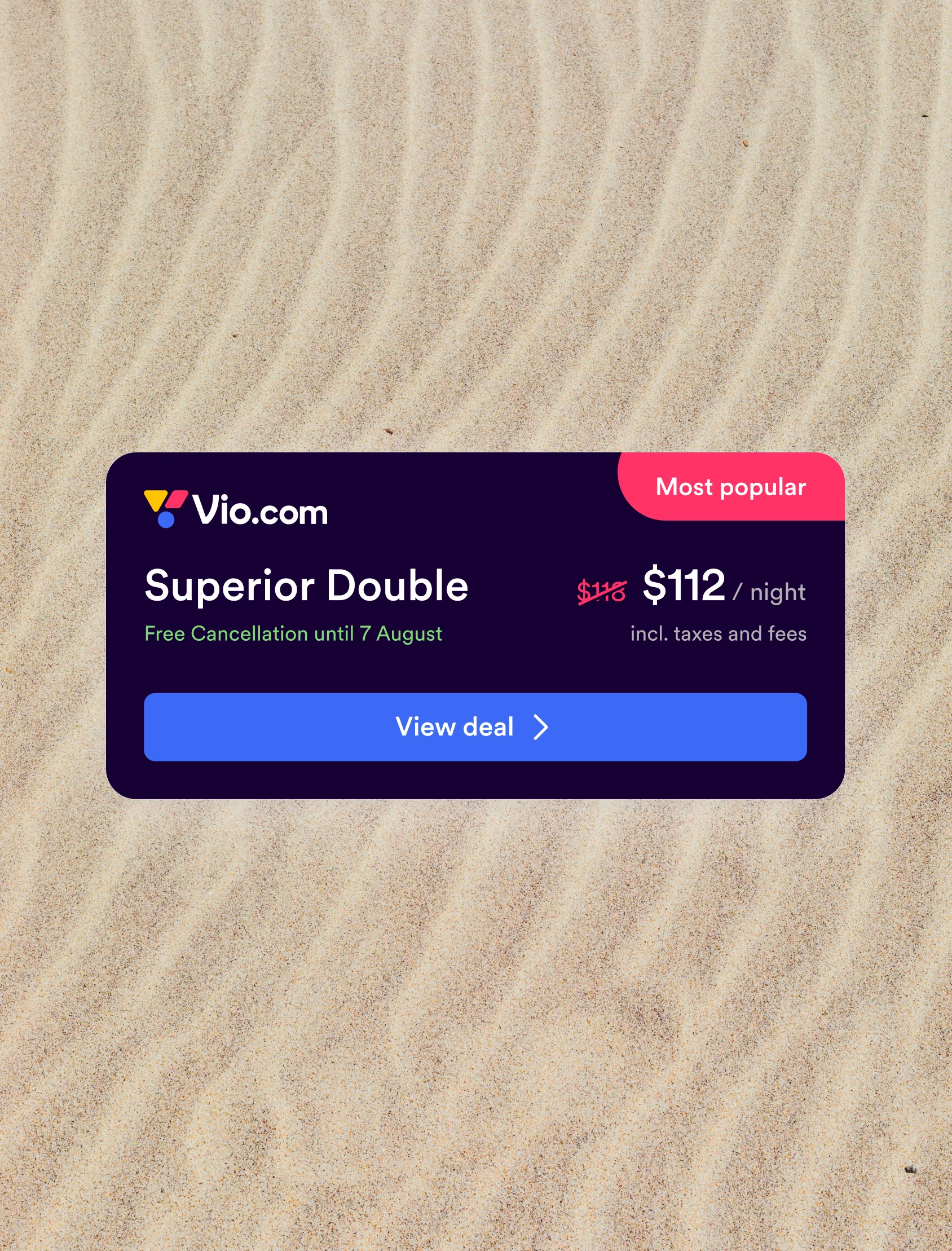
We designed a logo system that stays readable at small sizes and supports the decision to use the full domain name “Vio.com.” The shape language was built to be modular, so it could create structure in marketing assets and introduce subtle brand cues in the platform UI, without disrupting usability.


Making the brand usable inside the product
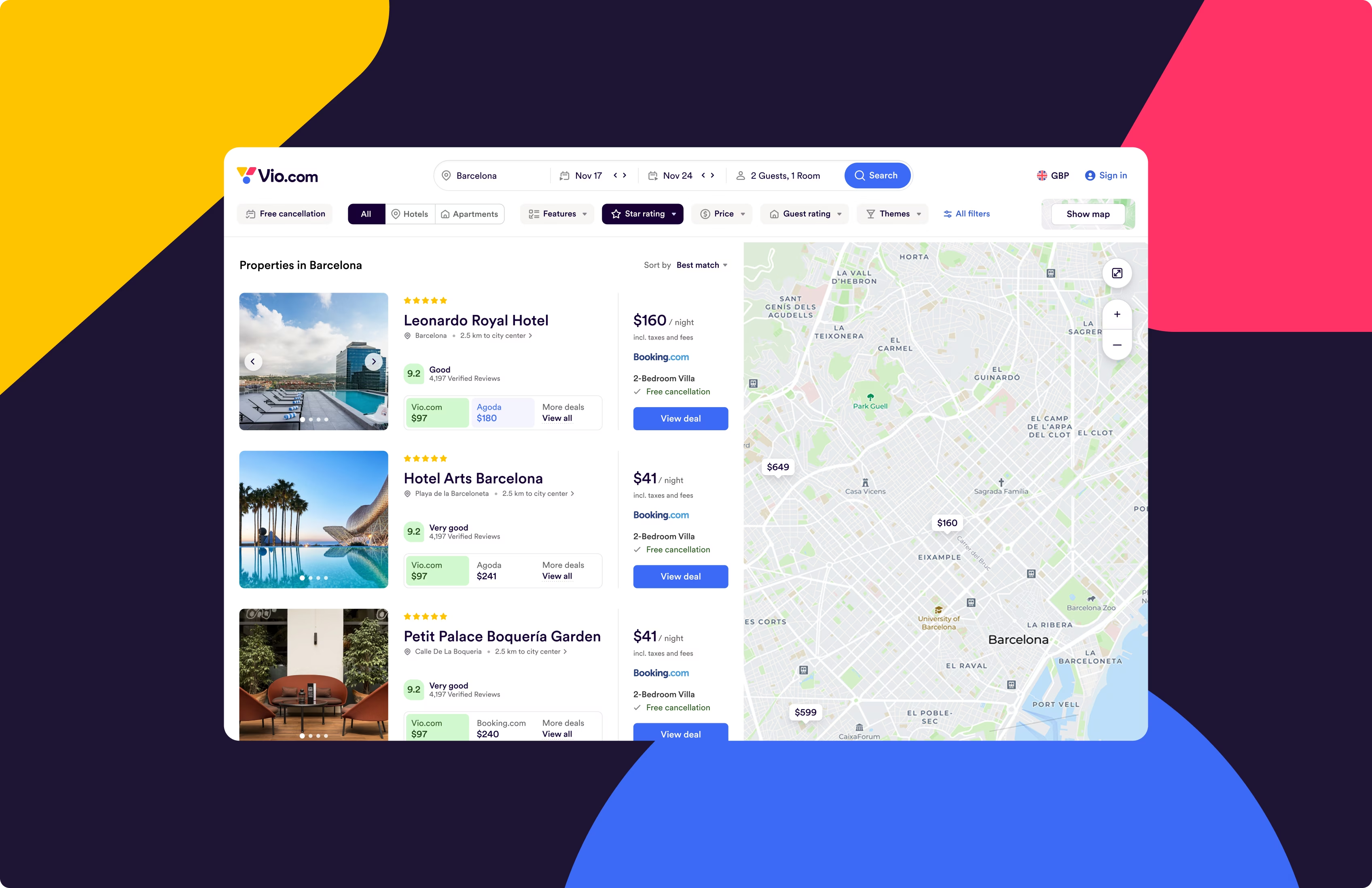
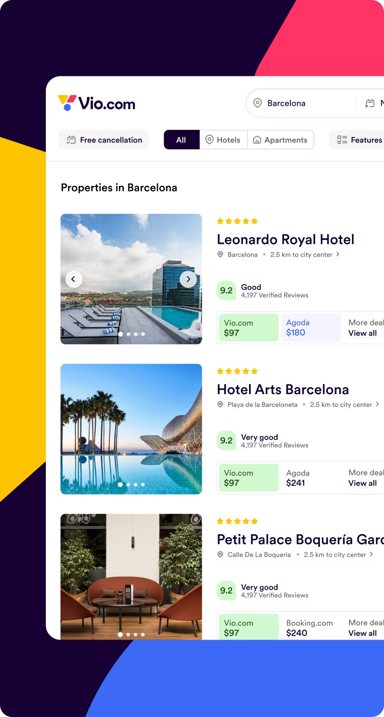
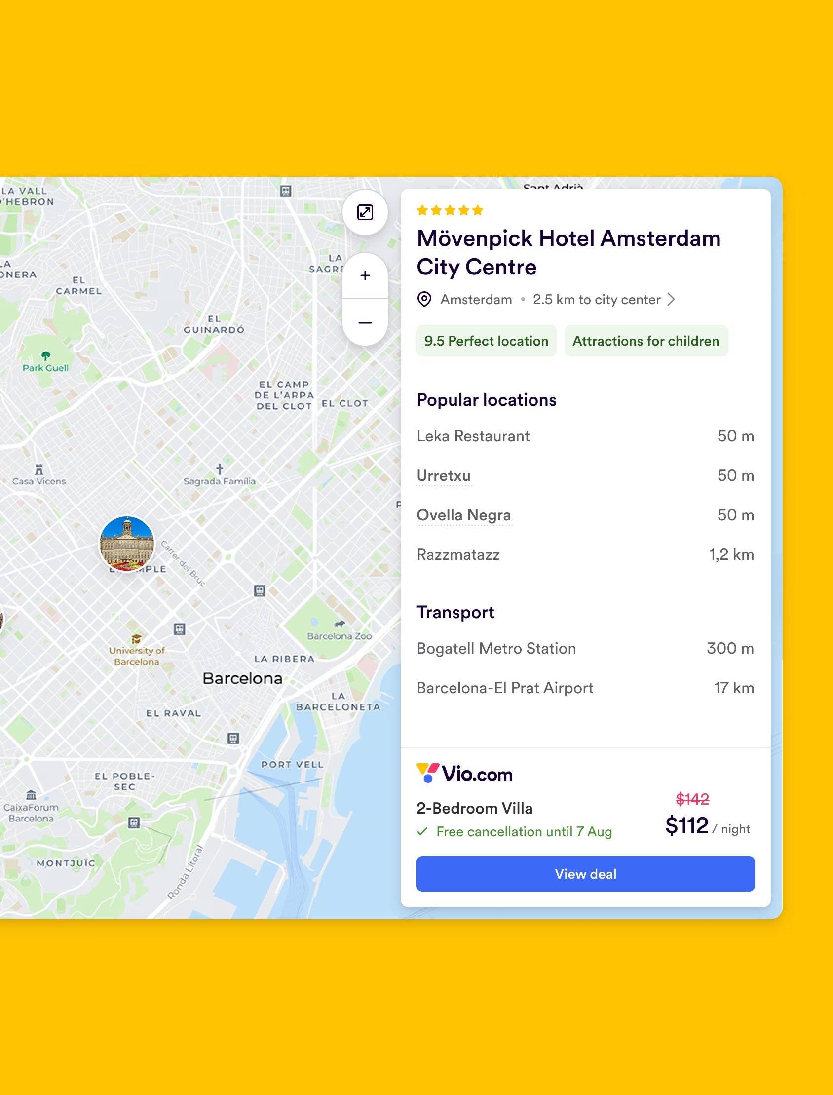
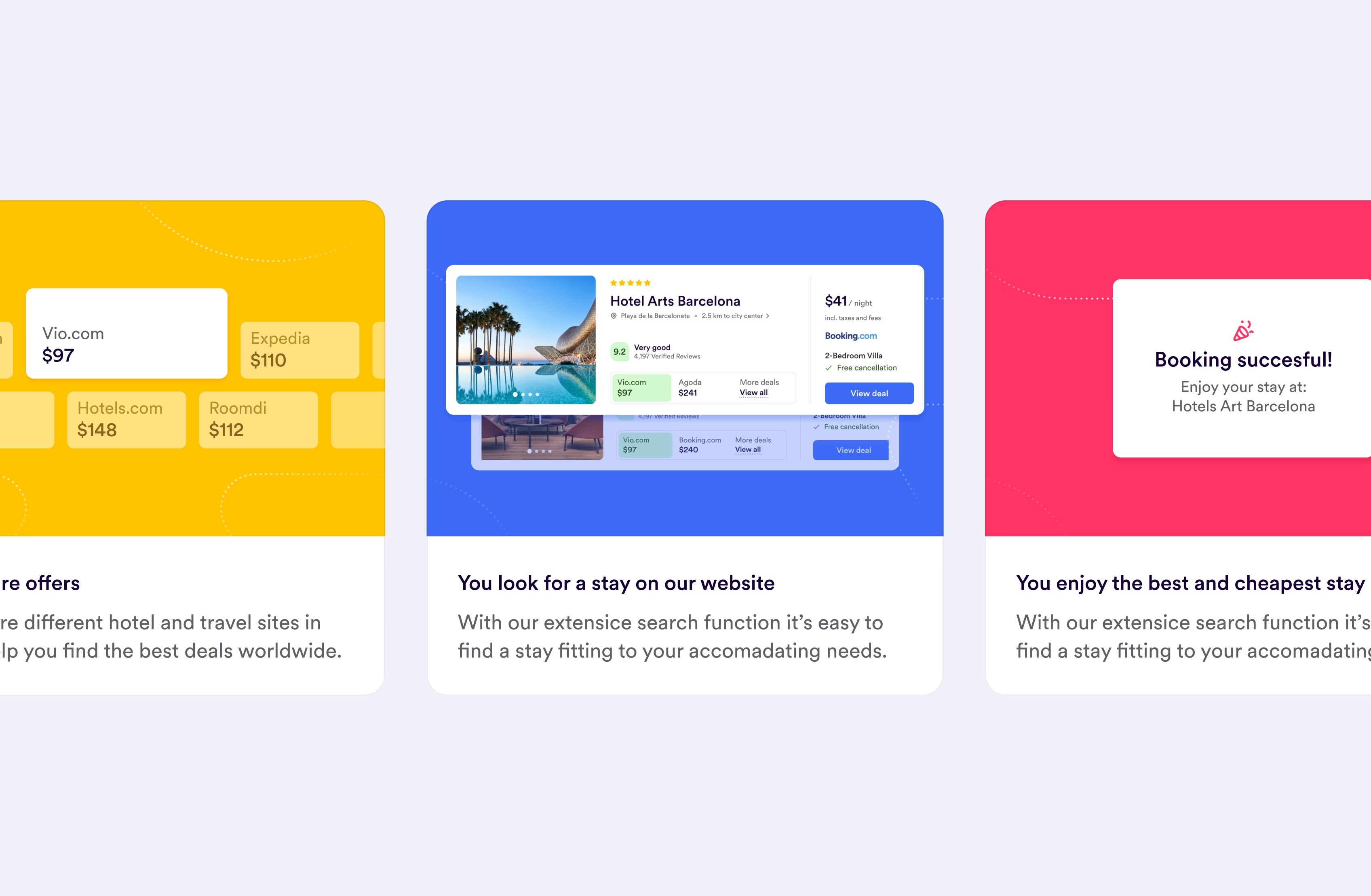
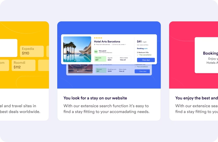
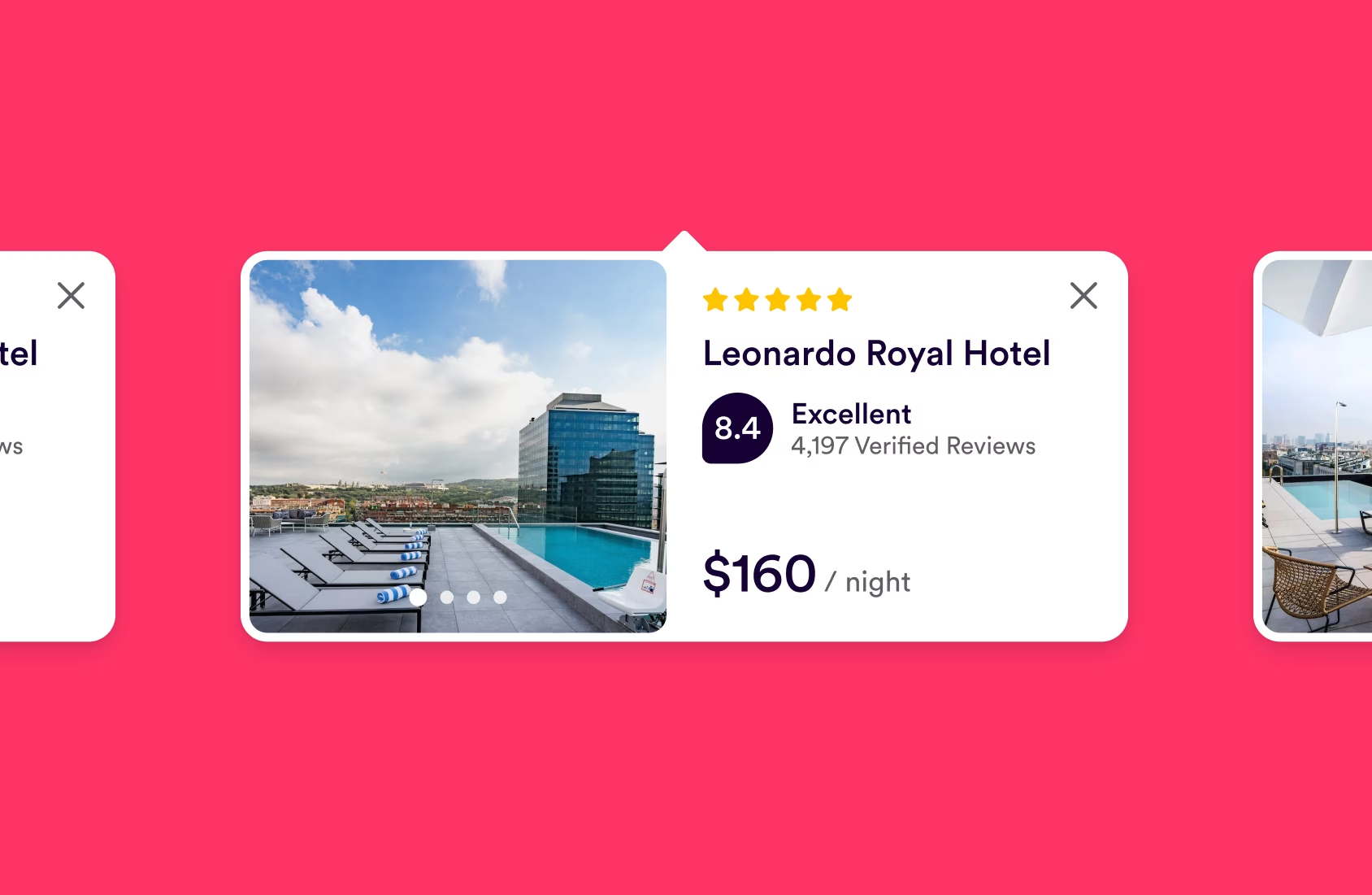
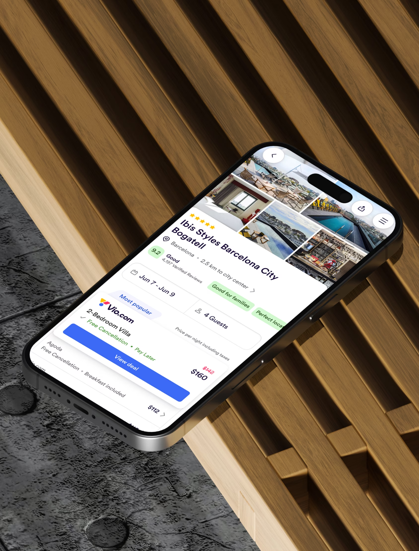
The most important touchpoint was the platform itself: Findhotel becoming Vio.com. The challenge was balancing two things that often clash: introducing a new, confident expression, while keeping the experience familiar for existing users.
We translated the Vio.com identity into interface patterns and product design guidance that the team could apply across core areas of the UI. Not decoration, but system choices that support hierarchy, scanning, and clarity, while meeting accessibility standards.

Extending the brand beyond the screen
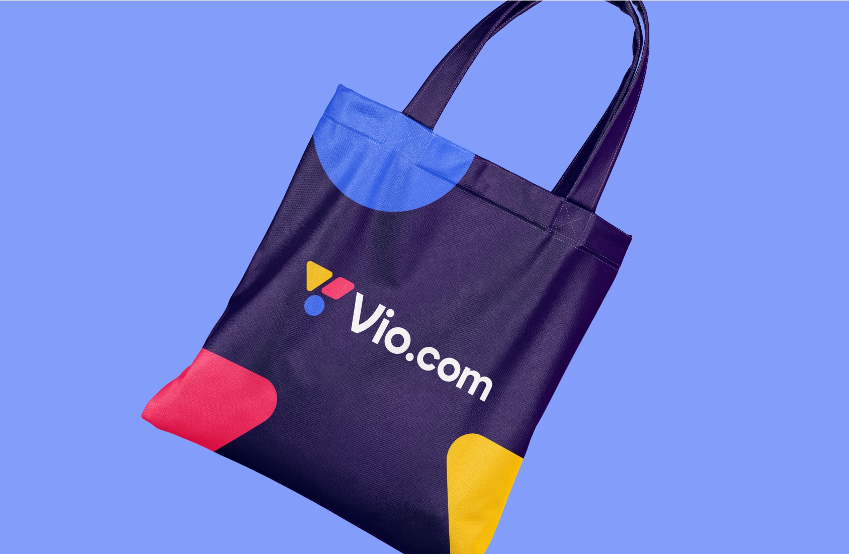
Because travel brands are built before users land in the product, we translated the Vio.com system into a wider set of touchpoints. Digital assets, content formats, and physical expressions like event and team collateral. This helped Vio.com show up consistently wherever trust is built: in campaigns, partnerships, and presentations, not only inside the platform.

Vio.com now has a clear, scalable brand system that can be applied across product and marketing without losing consistency. The team has practical brand identity guidelines, interaction principles, and a foundation built to perform in real product contexts. Most importantly, the Vio.com brand is designed to function inside the platform experience, enabling the team to evolve the product while keeping the journey familiar, clear, and conversion-focused for millions of users.


