Classroomscreen
As Classroomscreen prepared to enter the US market, they needed to turn their powerful classroom tool into a clear, compelling story. Pricing lacked clarity, the product’s value wasn’t immediately obvious, and the website had to meet higher accessibility and compliance standards.
We reshaped Classroomscreen’s website and narrative to put clarity first. A custom marketing video on the homepage explains the product directly, while the site clearly communicates pricing and value for schools and districts at scale. Alongside the design work, we rebuilt the platform with a flexible CMS and front-end, grounded in a full accessibility audit and WCAG process. The result is a compliant, easy to maintain website that frees the team to focus on the core classroom experience.
What we worked on
- Accessibility Audit
- Creative Direction
- UX/UI Design
- Marketing Assets
- Front-end Development
- Accessibility (WCAG) 2.1
- Maintenance
|
Classroomscreen is an online whiteboard tool that empowers teachers to guide their classrooms with clarity and calm. By providing flexible widgets designed for live teaching, it brings structure to lessons, reduces distraction, and helps students stay focused. The platform supports teachers where it matters most: in the classroom, during moments that shape learning. |
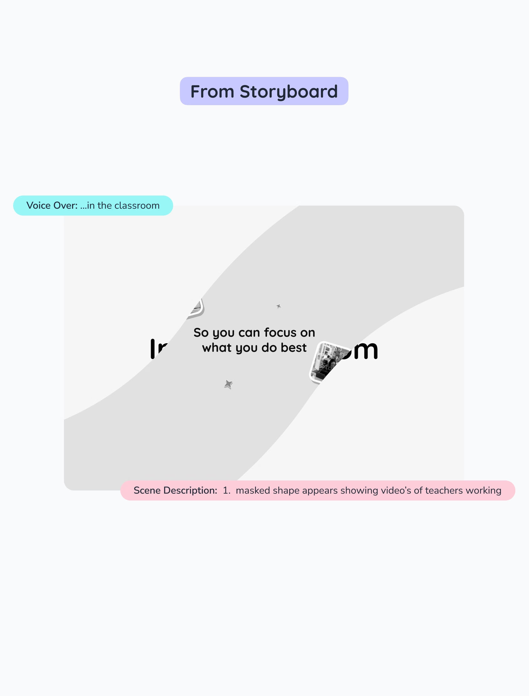
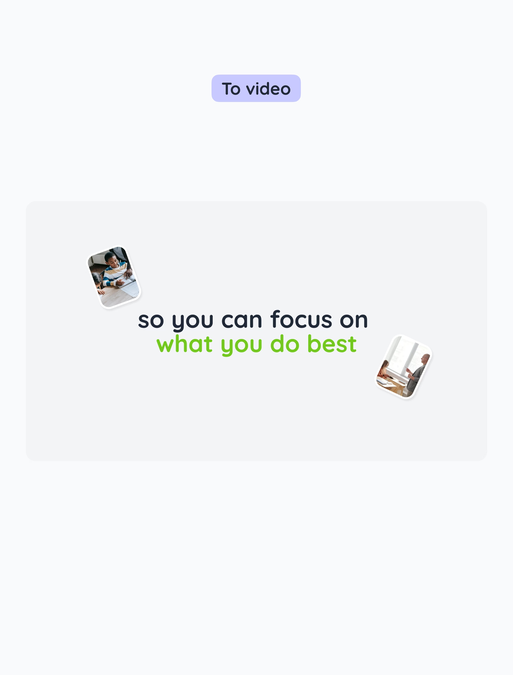
Classroomscreen needed a clear way to explain the product’s value without relying on a live demo, which made first contact with new audiences and use across marketing channels harder.
We began with an AV script workshop to align on story, messaging, and the moments that matter most in the classroom. The 1.5-minute marketing video blends real classroom situations with product footage, showing teachers using Classroomscreen in context. It highlights key widgets, everyday teaching flows, and the extensive customization options that adapt to different teaching styles.
This gave the team a shared narrative and a clear visual language to introduce Classroomscreen consistently, whether on the homepage, in campaigns, or across social channels.


The previous website made it hard to communicate Classroomscreen’s value across different audiences. We hosted a strategy session with the team where we aligned on core messages, target groups, and what users need to understand first.
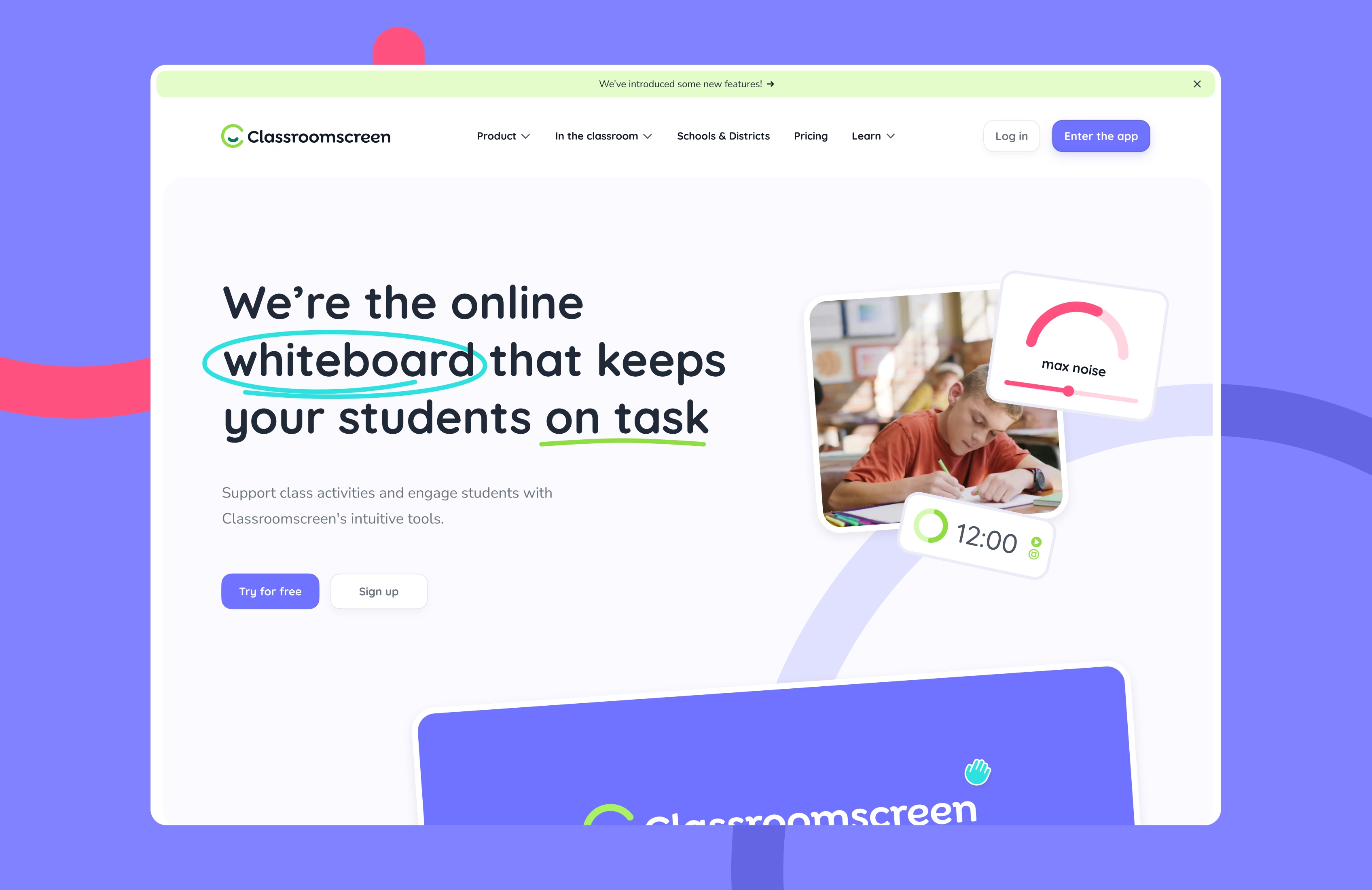
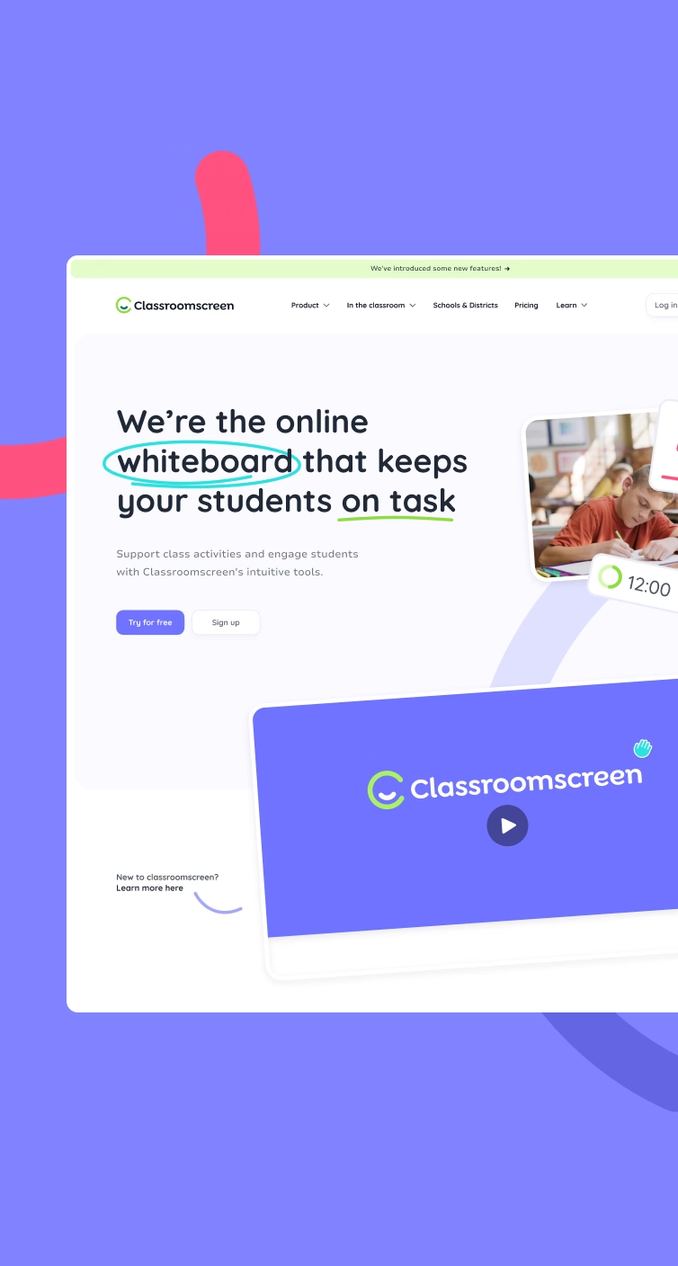
We translated this into a more engaging homepage with a bold new hero and the marketing video placed directly underneath to show Classroomscreen in action. “Windows” into the use case pages and the refreshed Schools & Districts page help teachers and decision-makers quickly recognize their own classroom reality.
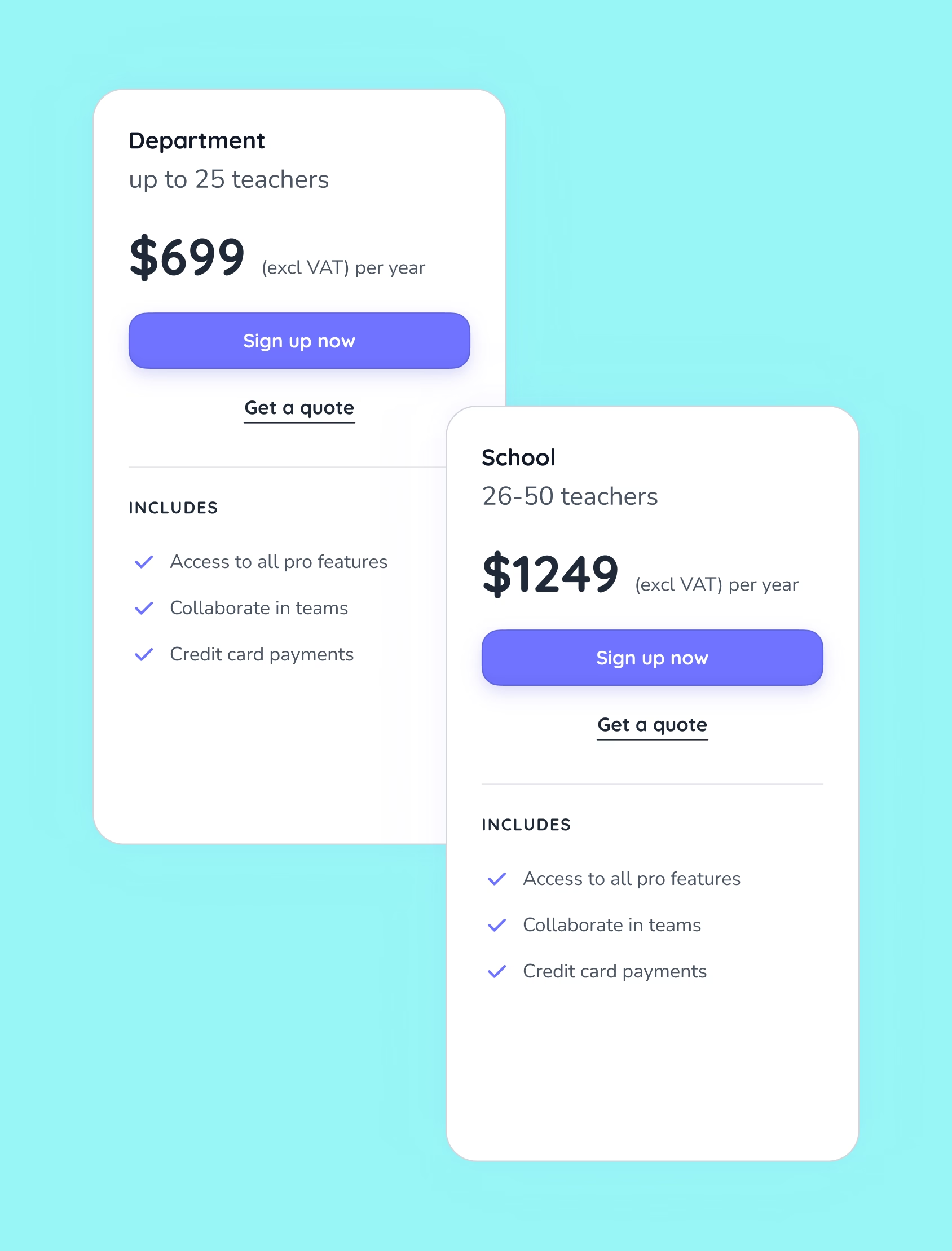
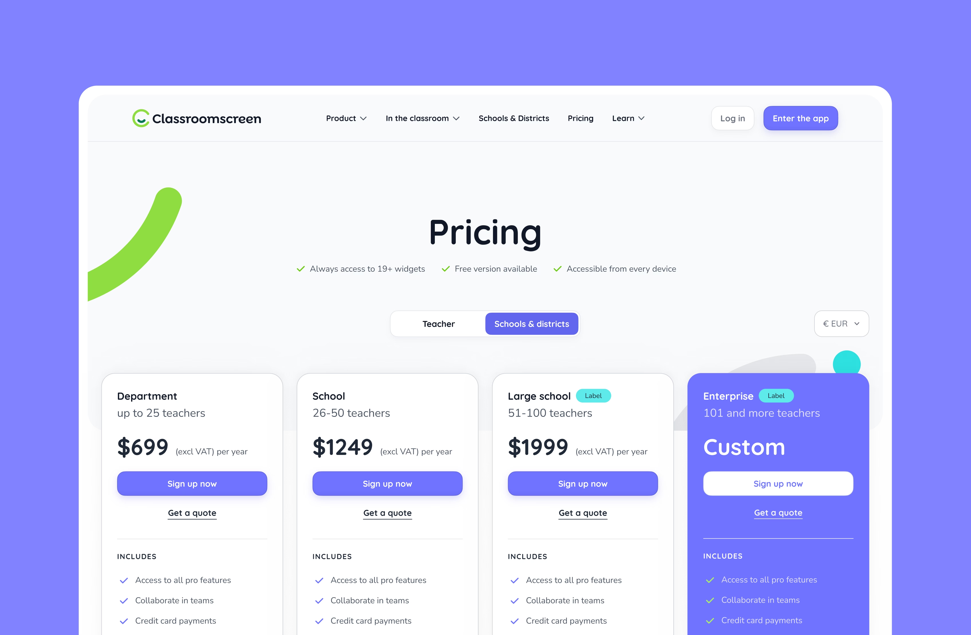
Pricing was restructured into five clear plans with fixed benefits, reducing friction in conversations and removing repetitive support questions. Together, these changes bring focus, clarity, and momentum to how Classroomscreen presents itself.
Accessibility was a requirement for US expansion, but rewriting the platform was not an option. We made a deliberate choice to treat accessibility as a system-level capability rather than a visual override.
By introducing an accessibility preferences layer with high-contrast and reduced-motion modes, Classroomscreen can now meet accessibility expectations without fragmenting the product. The existing color token system was remapped to maximum-contrast variants, ensuring both current and future components inherit compliant contrast behavior automatically.
For Classroomscreen, this means accessibility no longer slows down product development. New features and pages behave correctly by default, reducing risk during expansion and increasing trust with schools and districts that expect compliance.
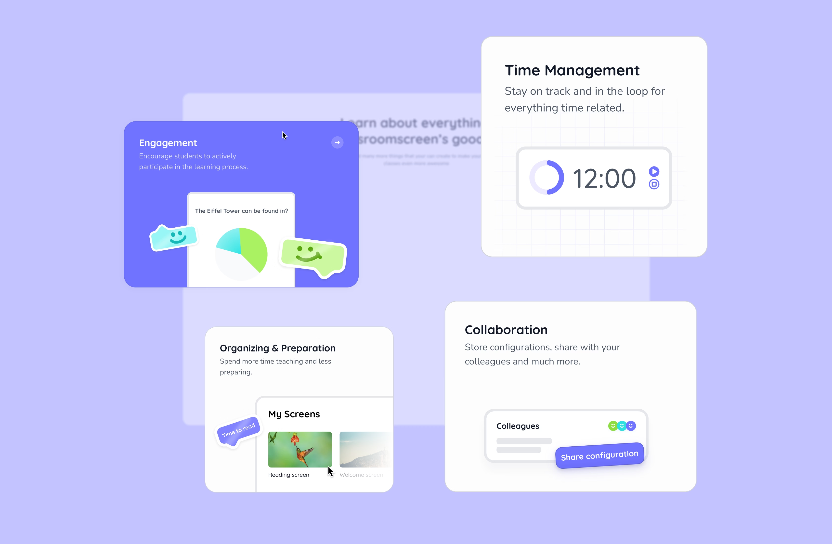
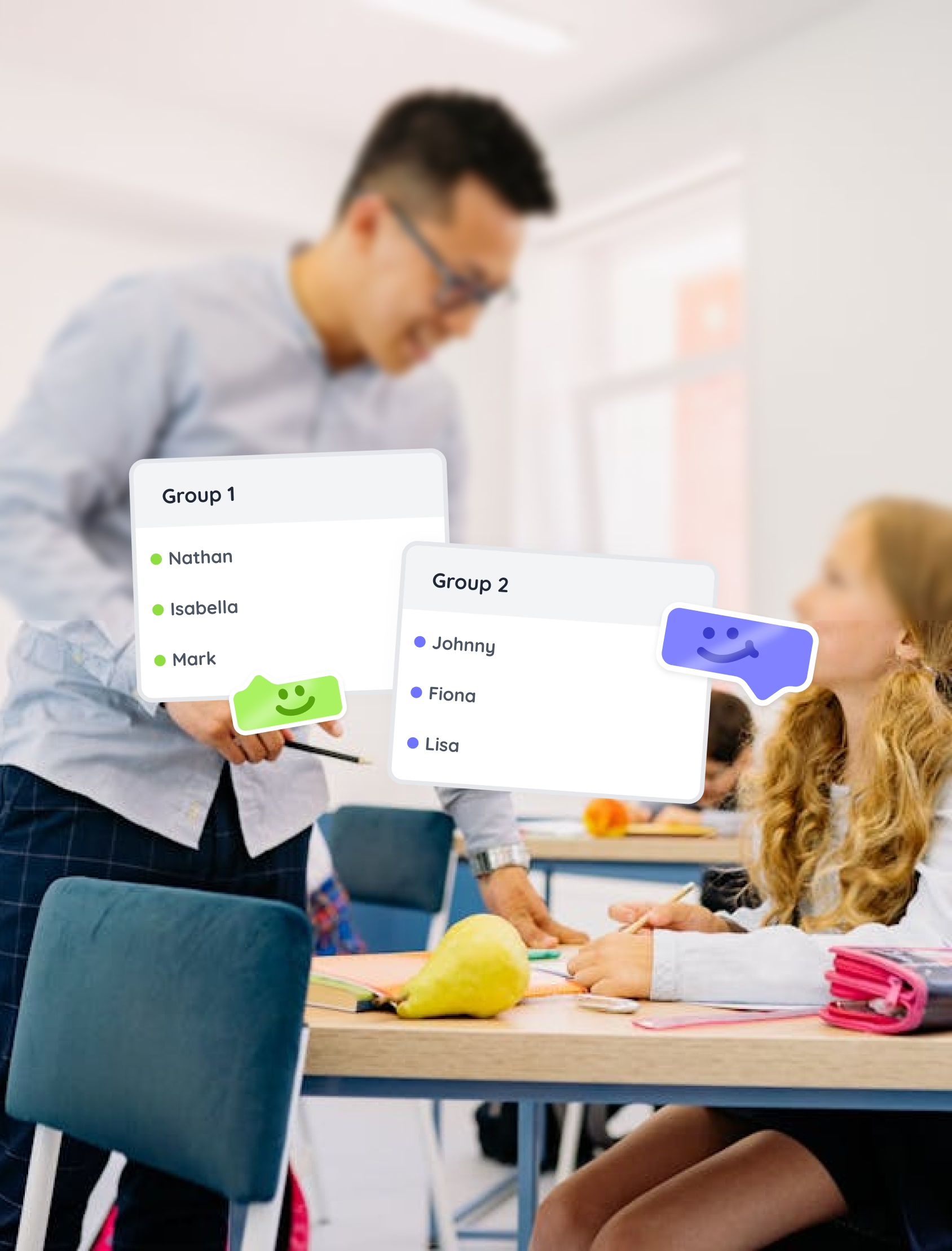

Previously, Classroomscreen’s help center lived on a separate domain and no longer matched the product, brand, or content they were creating. We redesigned the help center as an integrated part of the main website, bringing support, learning, and product exploration into one place.
Teachers can now discover templates and learn how to use individual widgets, while school and district stakeholders can easily find information on pricing, billing, and account management. We designed and built the help center to scale with their content, ensuring it stays on-brand, up to date, and easy to maintain.
All of this builds on a brand foundation we designed earlier: a friendly, recognizable identity rooted in circular forms, playful motion, and a flexible Design Library. That brand now runs consistently through the website, marketing video, help center, and platform, creating a cohesive experience across all touchpoints.
Together, these updates give Classroomscreen a platform that’s clearer to understand, easier to maintain, compliant at scale, and ready to grow with new markets while allowing their team to stay focused on what matters most: supporting teachers in the classroom.
Bounce rate decrease
more website visitors (+15%)
|
During the initial branding project we found Yummygum to be an agency with lots of experience in branding and detailed icon design. Their team listened to our needs and pro-actively helped us make decisions. We worked together again to create our marketing website, which is a reflection of who and what Classroomscreen is, from scratch. They impressed us again through their technical knowledge as they built the new website using our preferred tech stack and implemented a user friendly CMS. The same CMS now allows our marketing team to take things to the next level. |
