What we did
Brand Strategy
Knowledge Sharing
User Research
Information Architecture
UX/UI Design
Website Design
Graphics & Illustrations
Pitch Decks
Brand Identity Guidelines
Design System
No-code Development
Animations & Interactions
Digital Identity
Client

01
Introduction
Impierce embeds trust into every digital interaction. Their Self-Sovereign Identity solutions streamline verification, credential issuance, and secure data sharing, enabling organizations to prevent fraud, ensure compliance, and give users control over their own identities. The platform supports seamless onboarding across ecosystems, with a focus on privacy, interoperability, and open standards.

02
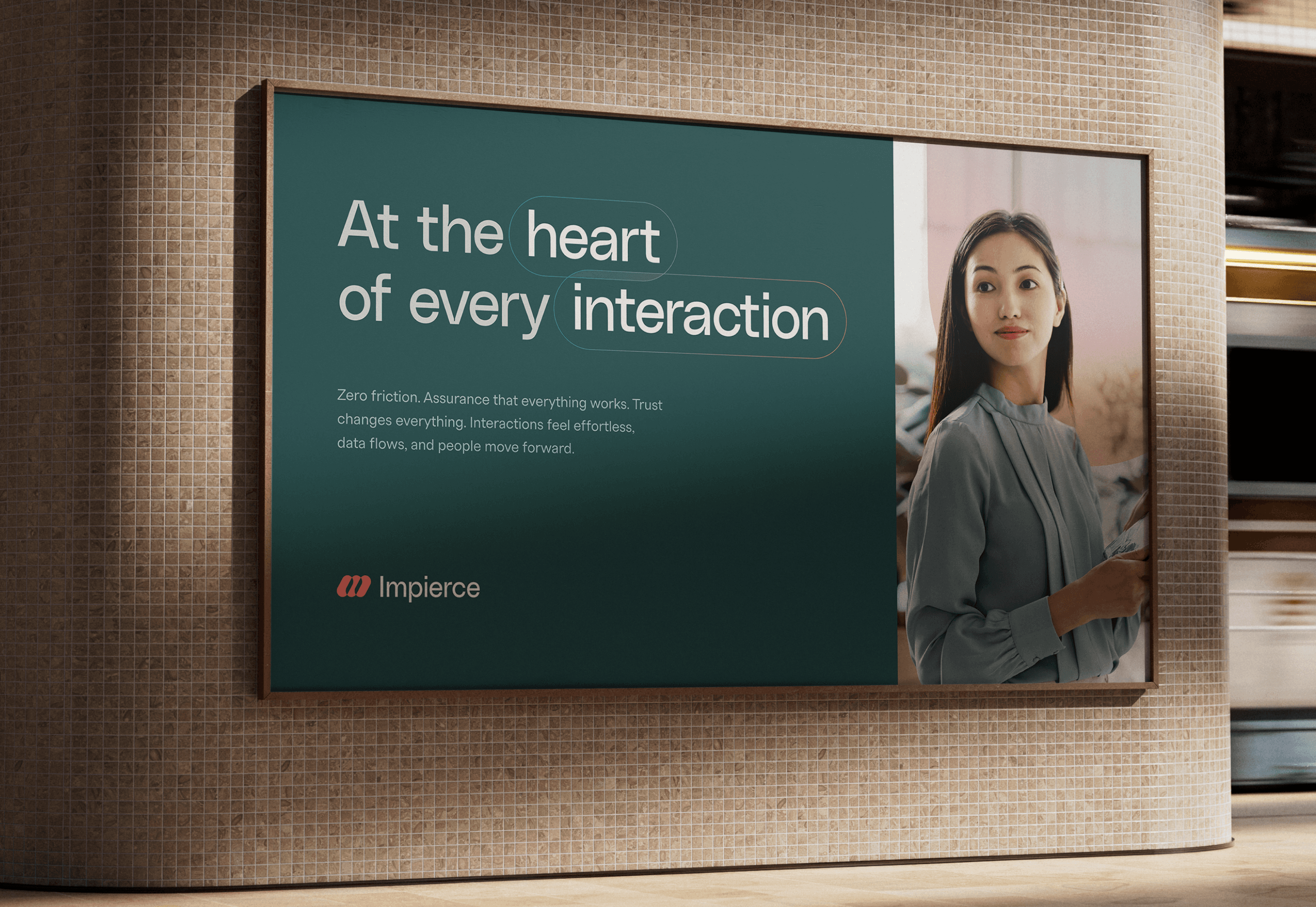
At the heart of every interaction
Impierce needed a brand strategy that made their role as a trusted enabler in the digital identity space clear. To uncover their values, audience, and personality, we ran a brand strategy workshop with the team. From that foundation, we shaped an identity built around a single concept: "at the heart of every interaction." This reflects Impierce's purpose: wherever people and organizations meet, they act as the neutral, enabling core. Every visual element reinforces that. Facilitation over control, trust made visible.



03
Creating the mark
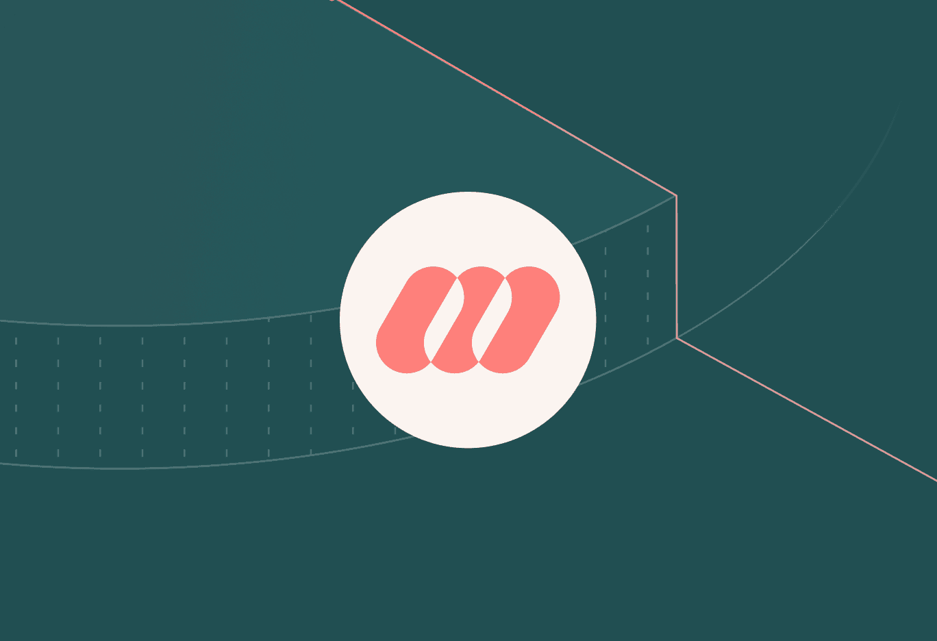
The Impierce logo embodies collaboration across domains. Connecting people, organizations and industries while nodding to the roles of holders, verifiers and issuers in the trust ecosystem. Its forward-leaning geometry captures movement and progress, reflecting Impierce's drive to help others move forward with confidence. The overlapping forms extend throughout the brand, symbolizing how Impierce unites different parties within a single trusted layer. A pattern generator was built alongside, making it easy for the team to produce new brand assets without drifting from the system.


04
Designing the experience
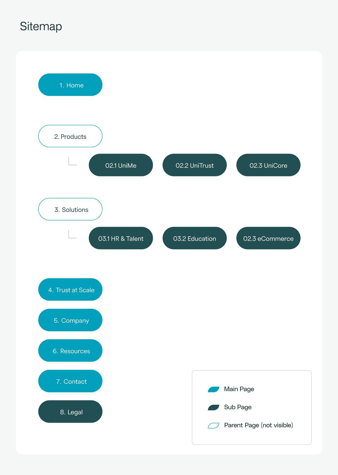
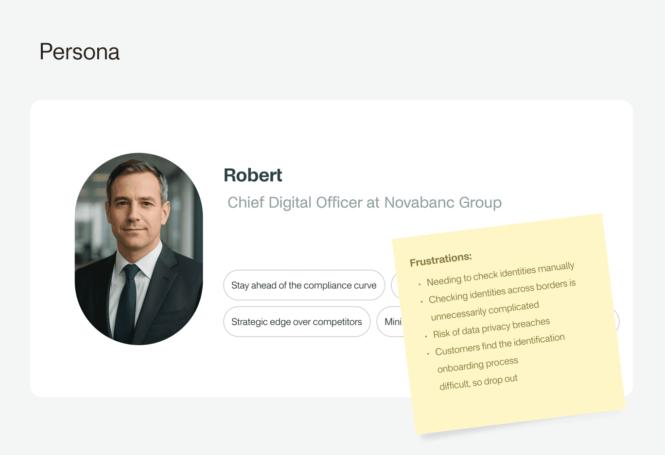
The website needed to speak to multiple audiences at once: business professionals, technical experts, and EU citizens, each with different knowledge and needs. Early research shaped detailed personas and a three-tier information architecture: a high-level trust ecosystem story, product-specific detail, and technical depth for specific roles. Wireframes focused on clarity, making concepts like DIDs and Verifiable Credentials accessible without oversimplifying. A dedicated "trust at scale" page highlights open standards, certified compliance, and privacy-first design for audiences who need that reassurance before they engage.


05
Clarity through visuals
Illustrations were designed on an isometric grid to balance technical precision with approachability. Warm red tones soften the aesthetic and keep visuals feeling human-centered, a deliberate choice for a platform that deals in identity and trust. The system works across light and dark backgrounds and is flexible enough to grow with the website, without requiring new design decisions each time a new use case needs to be visualized.


06
No-code, full speed
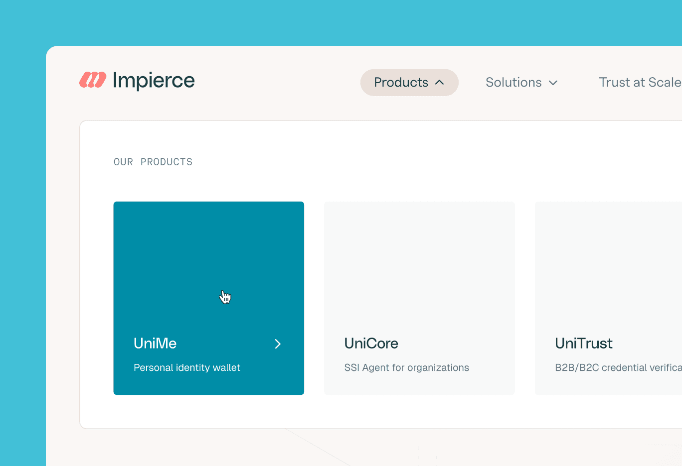
In close collaboration with Impierce, we chose Framer as their website platform. With few content updates expected at this stage, a heavily custom-coded solution would have been overkill. Framer makes it easy and cost-effective to add pages or adjust content without developer involvement, a practical fit for their scale-up phase. The trade-offs (limited CMS features, platform dependency) were assessed together, and the decision was made: speed, simplicity, and flexibility outweighed the downsides.


07
Built for developers, not designers
Impierce is a small team. Their development team builds everything, which means consistency across products can only be guaranteed through rules, not daily design involvement. Together we set up a Design System, and we built it alongside them: ten foundational components chosen for how often they appear across every surface. Getting those first ten right mattered. A component used just once doesn't belong in a Design System. Each one is documented with usage rules and decision flows, so developers know what to use and when, without a designer in the loop.
We proposed naming their design system Union, positioning it as part of Impierce's growing product suite alongside UniTrust, UniMe, and UniCore. When the next Impierce product gets built, Union is ready.


08
Exploring their platform
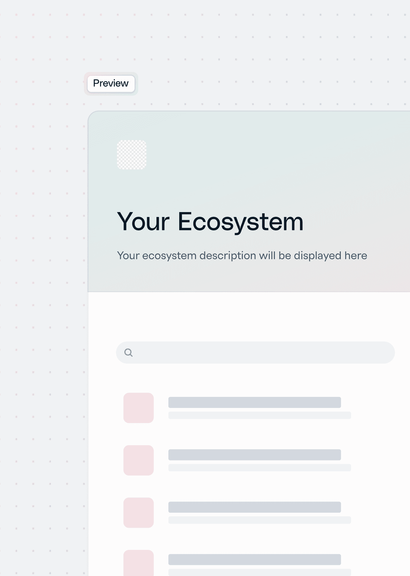
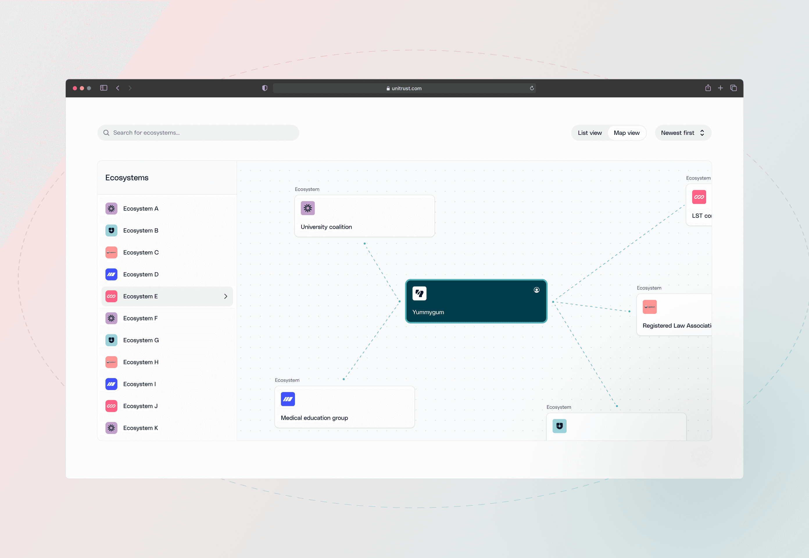
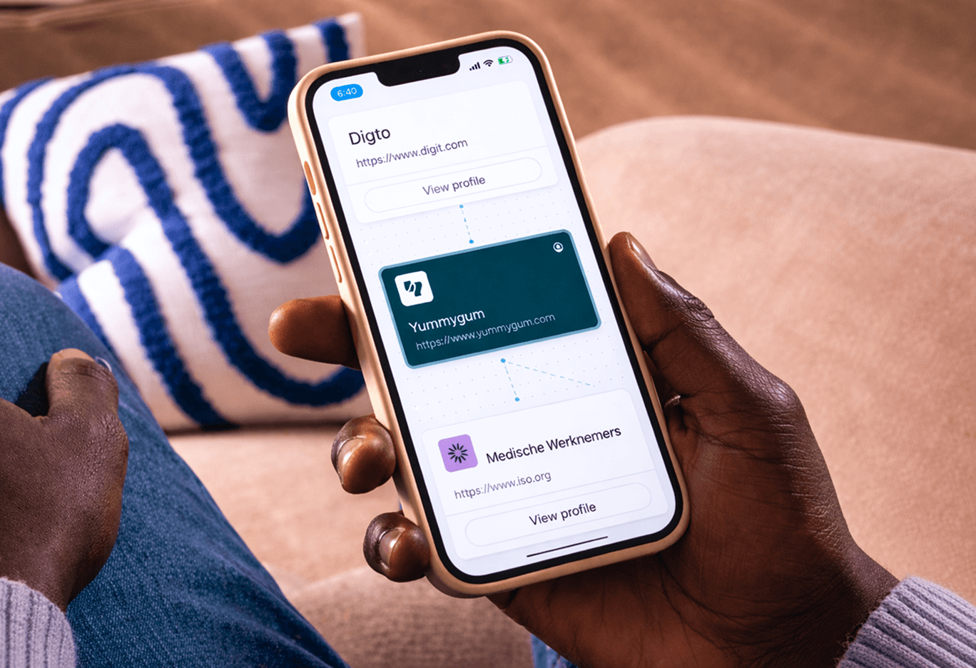
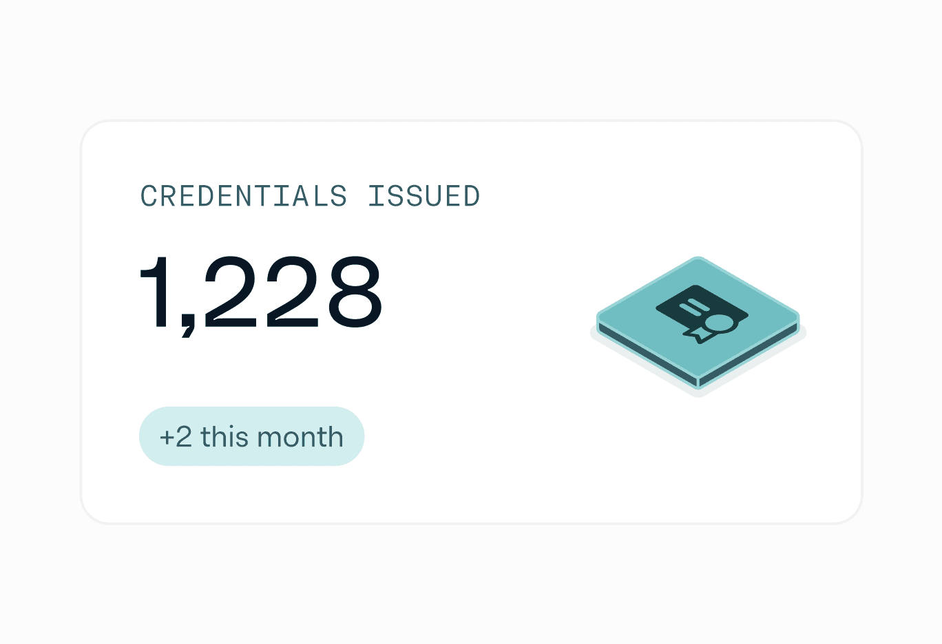
When Impierce asked us to design UniTrust, their web application for managing digital credentials, they had a working prototype built for engineers, not end users. We stepped back and studied consumer-facing UX patterns, adapting them for a complex B2B product. Designing the platform and extending Union happened in parallel: every component built for UniTrust fed directly into the Design System.
The brand translated through when and where it mattered, in various ways. Palette toned down, red held back where UX signaling needed to take priority, illustrations adjusted for context. What was once a dense developer tool now feels navigable to the people who need it most.


09
Results
Impierce now has a brand, website, and visual system that make their proposition clear to every audience without losing technical depth. Their identity signals authority and innovation. The website can evolve without developer overhead. And the Design System gives every product and platform a consistent foundation to build from. What was once too complex to explain is now a story that resonates with partners, investors, and users alike.



Related cases

Ready for your next phase?
A 30-minute call is enough to map the fastest path forward.