ORYX
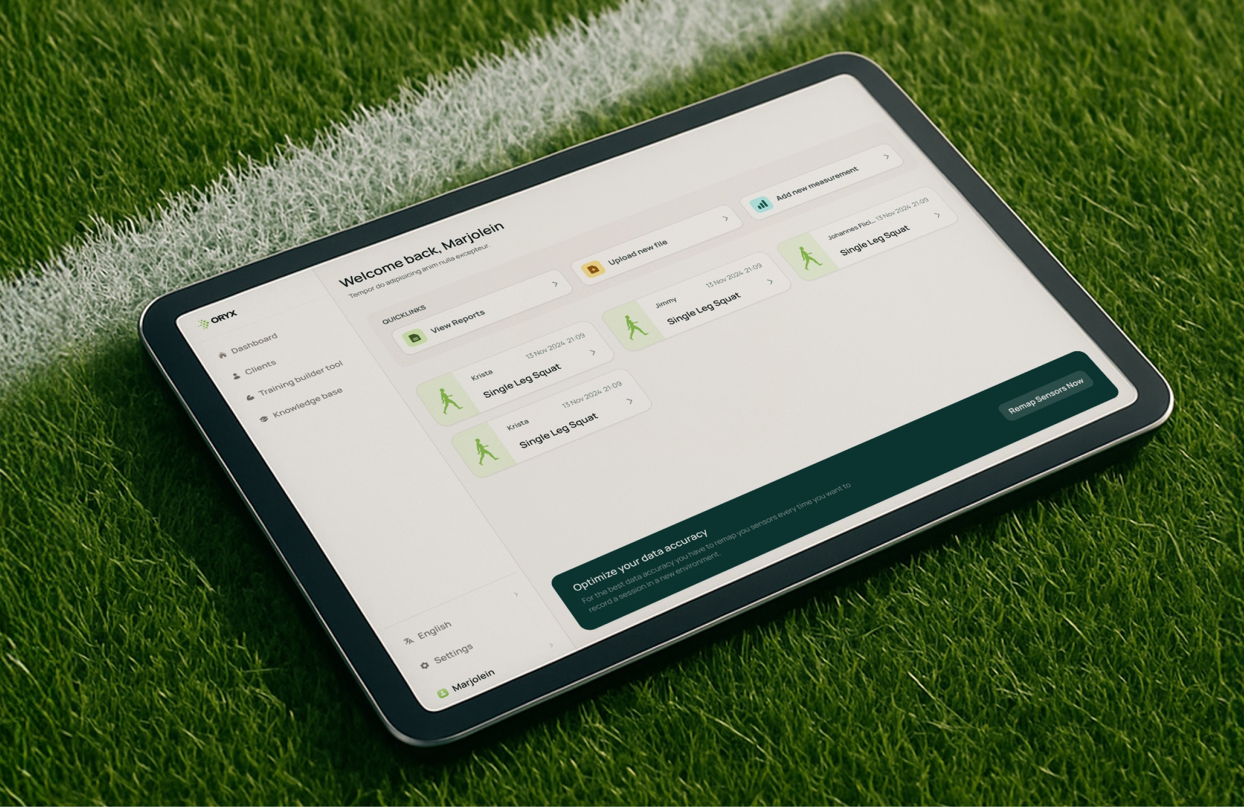
ORYX Movement Solutions had a platform experience that made user sessions harder than it should be, and sensor hardware constraints that created real risk around reliability and future expansion.
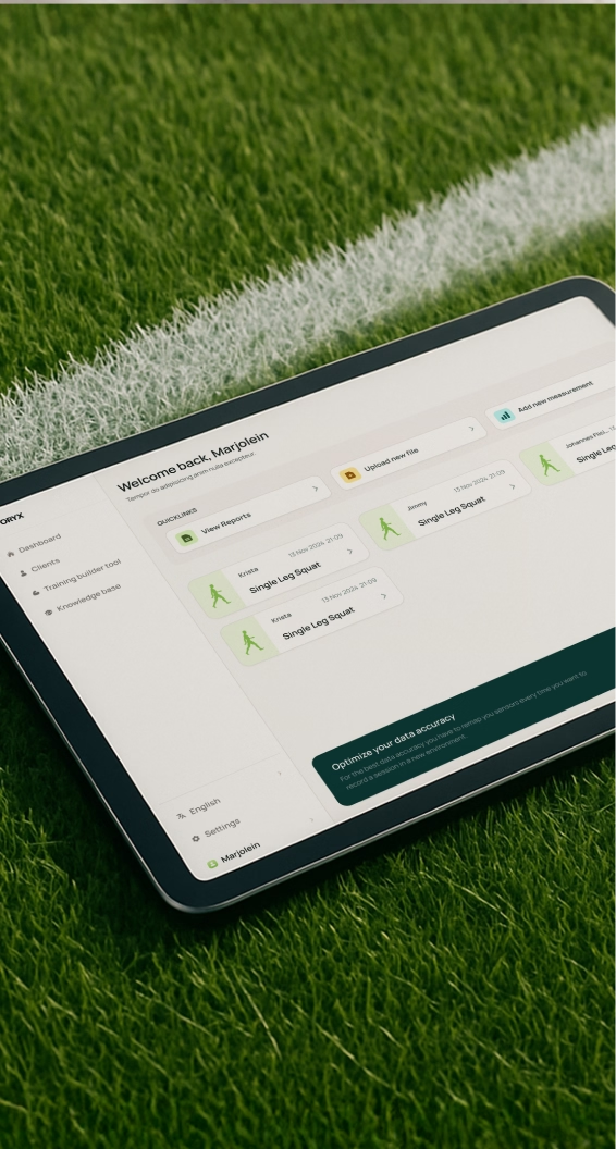
We partnered on Oryx’s platform experience and brand identity, grounding decisions in user research and information architecture. This now enables clear guidance through training flows and content as the library grows, while the technical strategy supports evolution within strict sensor constraints without breaking existing functionality.
What we worked on
- Brand Strategy
- Technical Strategy
- Creative Direction
- (User) Research
- Information Architecture
- UX/UI Design
- Mobile App Design
- Front-end Development
- Back-end Development
- Product Development
Tech stack
- React
- Ionic
- Firebase
- Swift
ORYX Movement Solutions builds hardware-enabled software for sports teams, physiotherapists, and movement professionals, turning real-world sensor data into insights that support rehabilitation, recovery, and performance improvement.
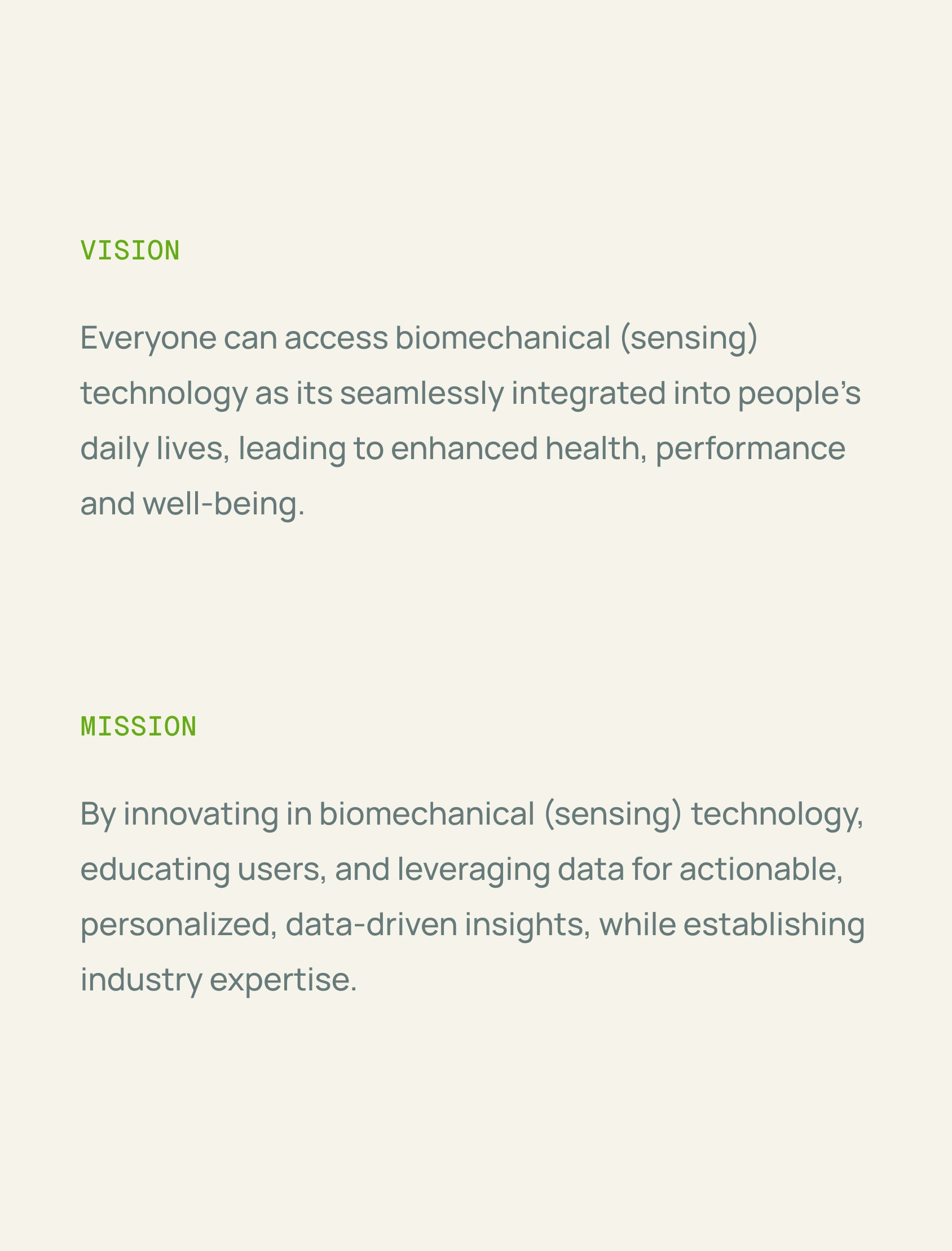
Aligning the team on what “different” actually means
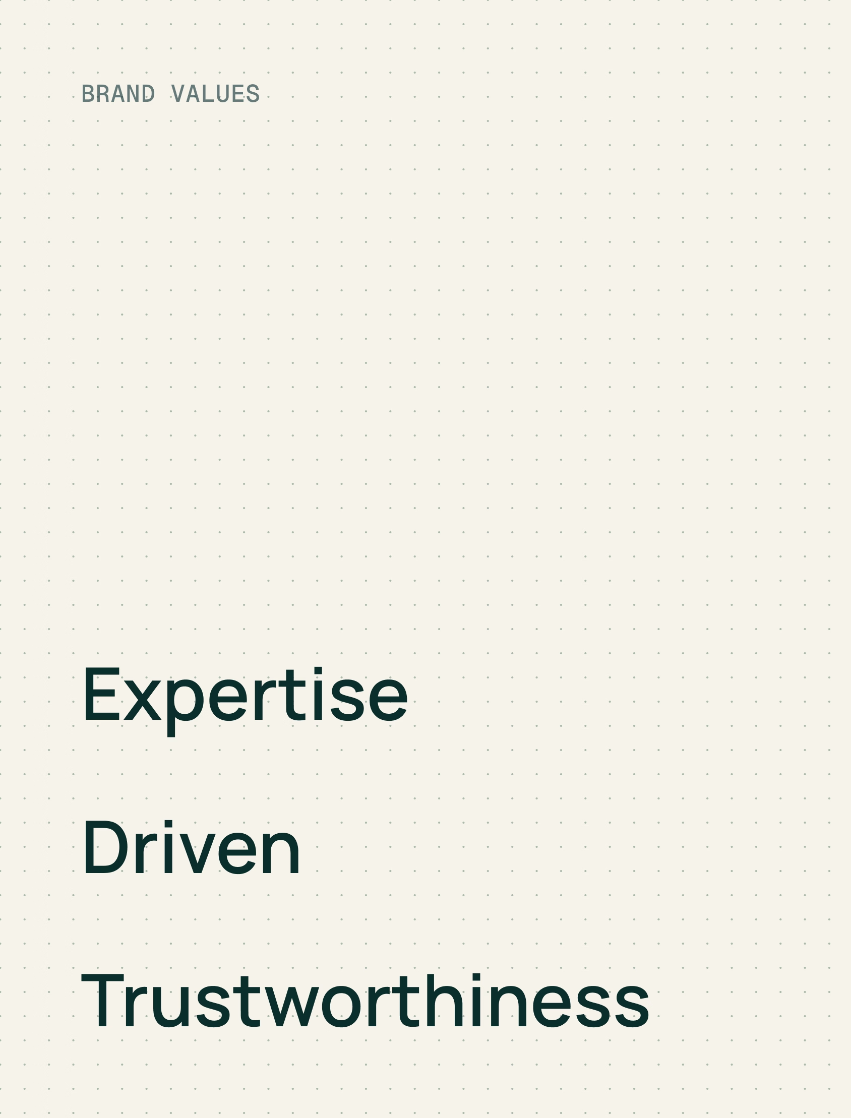
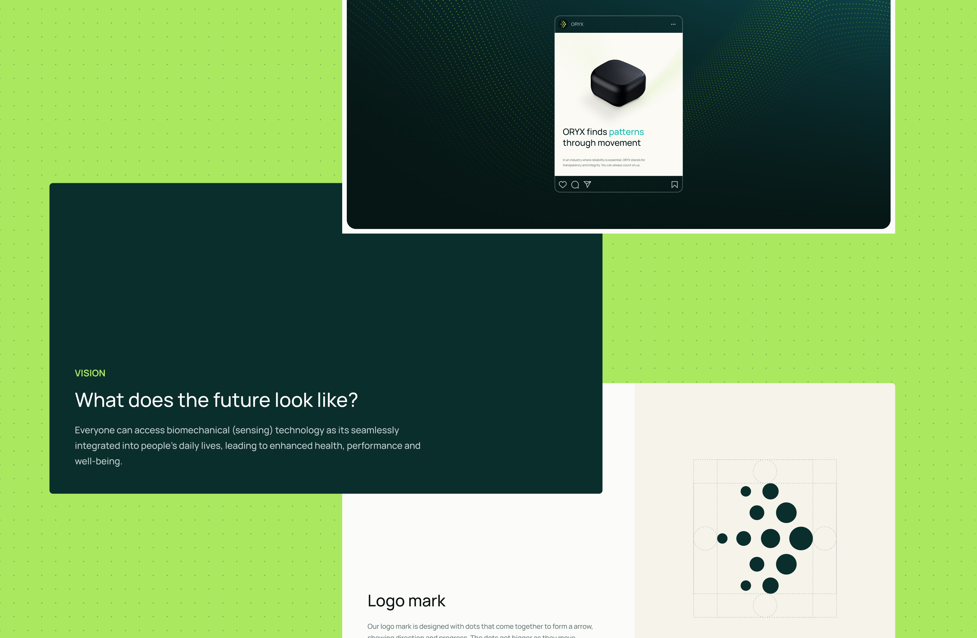
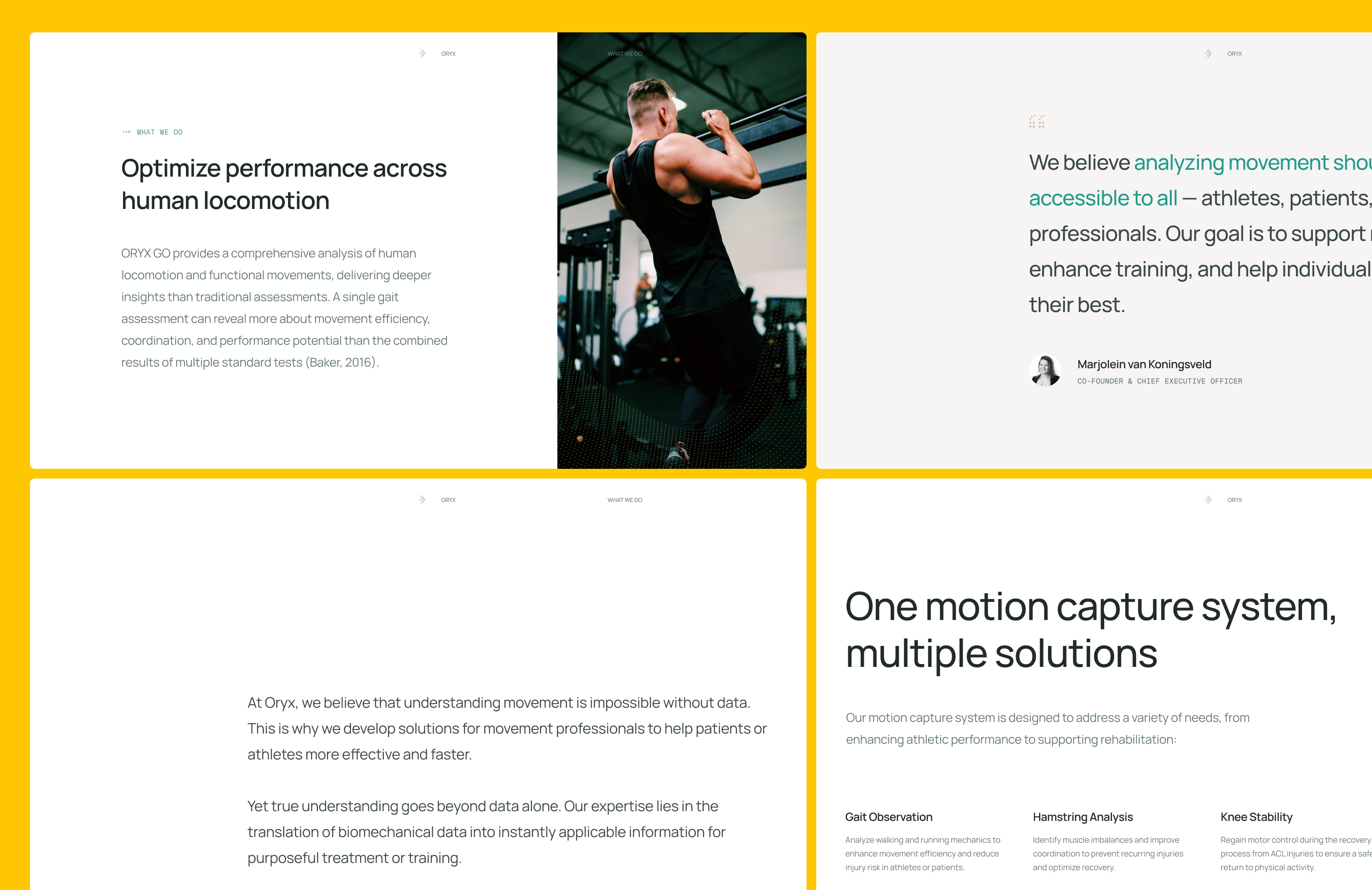
ORYX operates in a crowded category where many companies promise similar outcomes. That made it hard to explain why their data and approach were worth choosing, which is a direct risk when you’re trying to grow in a market full of alternatives. We ran a Brand Strategy Workshop to align on audience, values, and positioning, so the team could make consistent product and marketing decisions without debating the basics each time.
We anchored the story in “connecting the dots”: turning precise movement data into actions a professional can take, linking technical credibility to real decisions in rehab and performance.
Making sessions easier to complete under real constraints
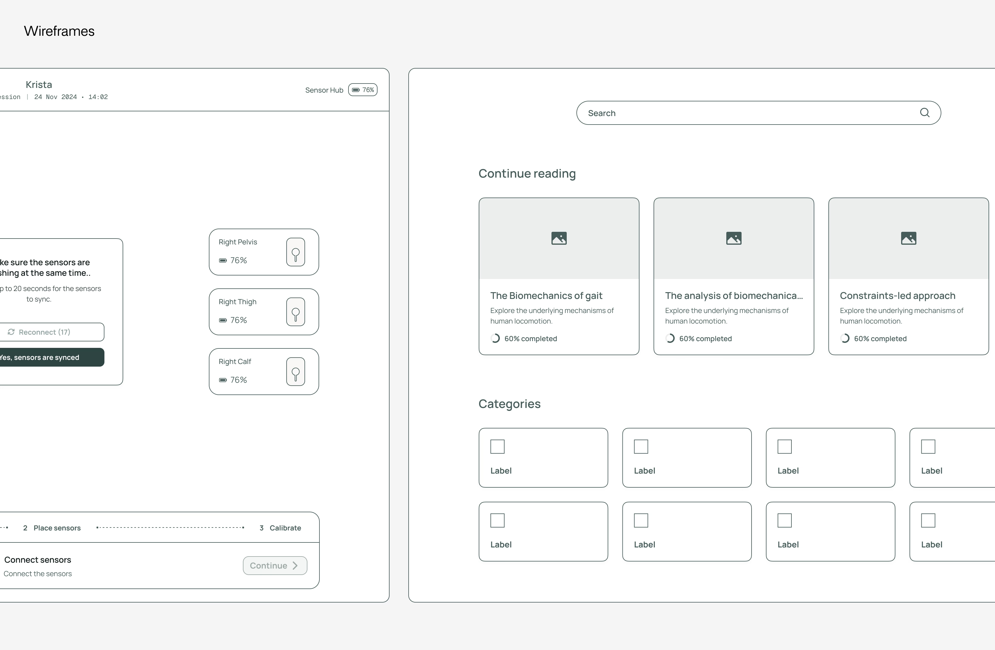
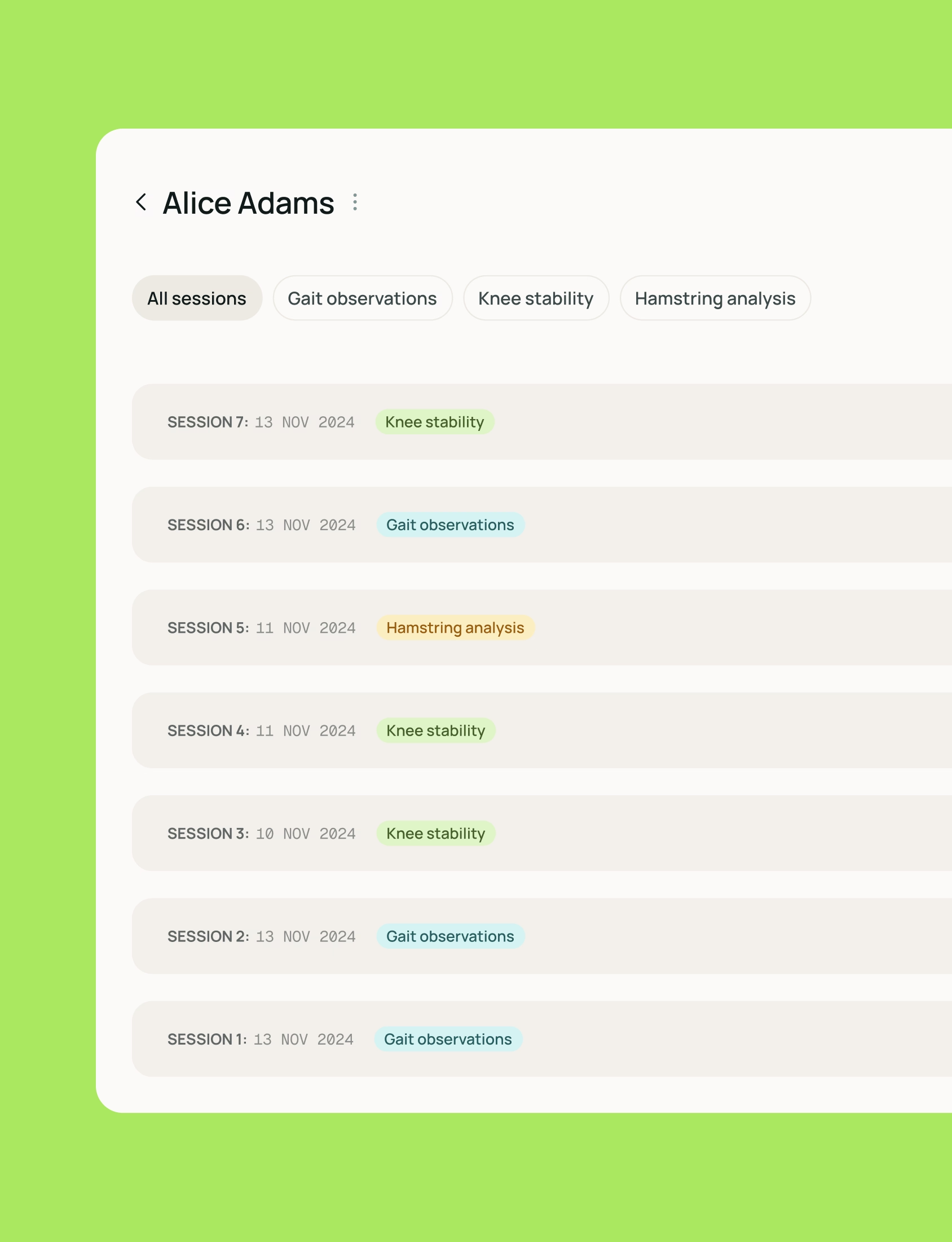
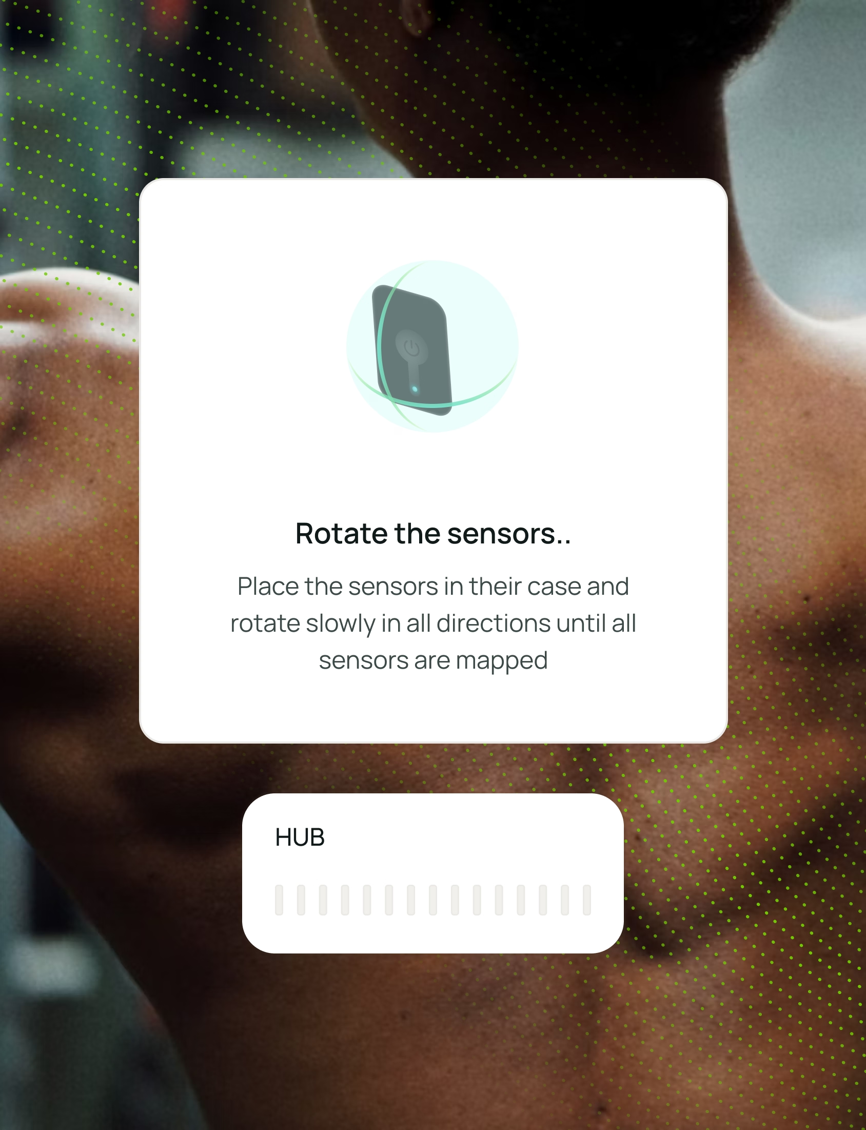
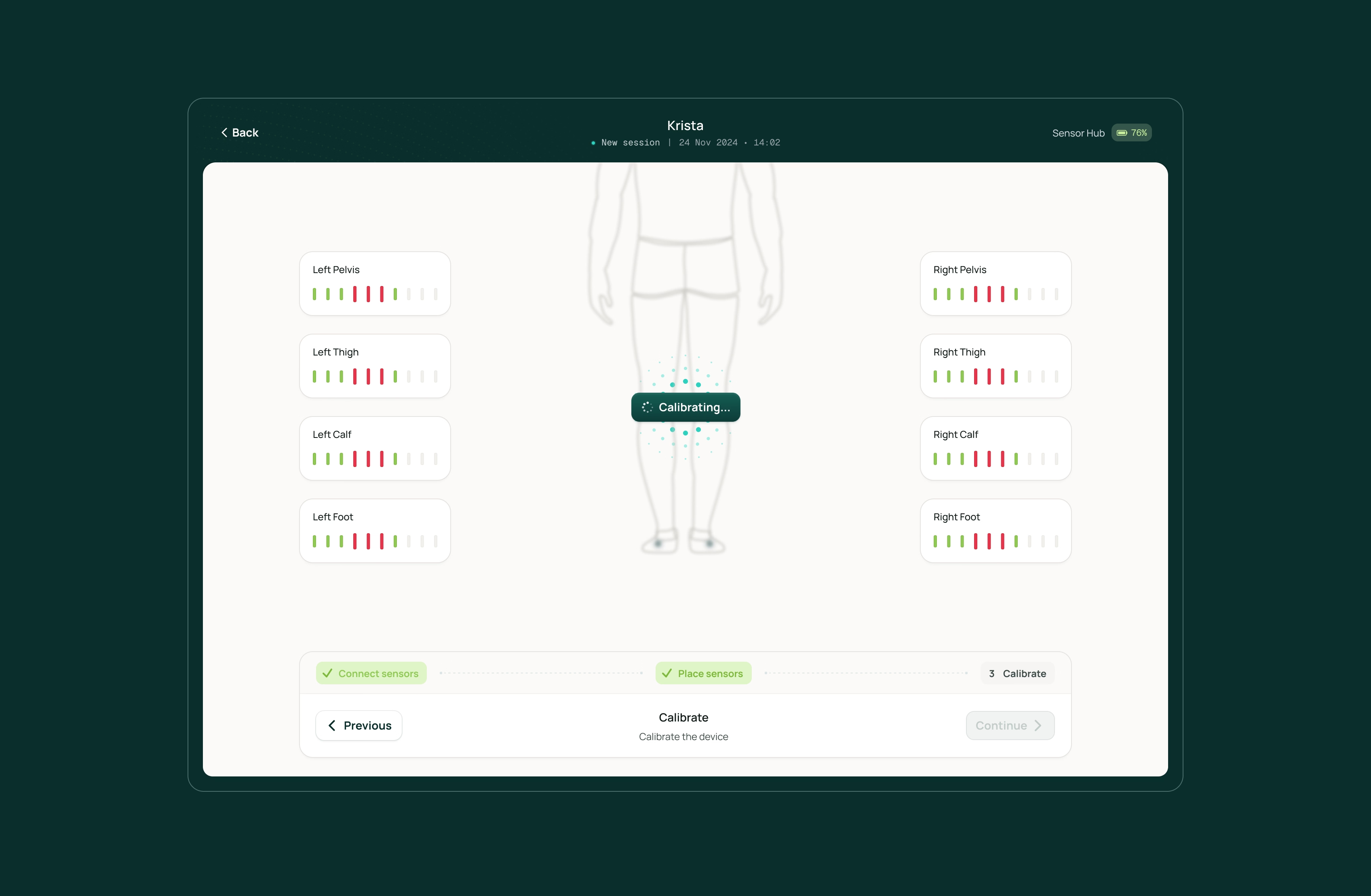
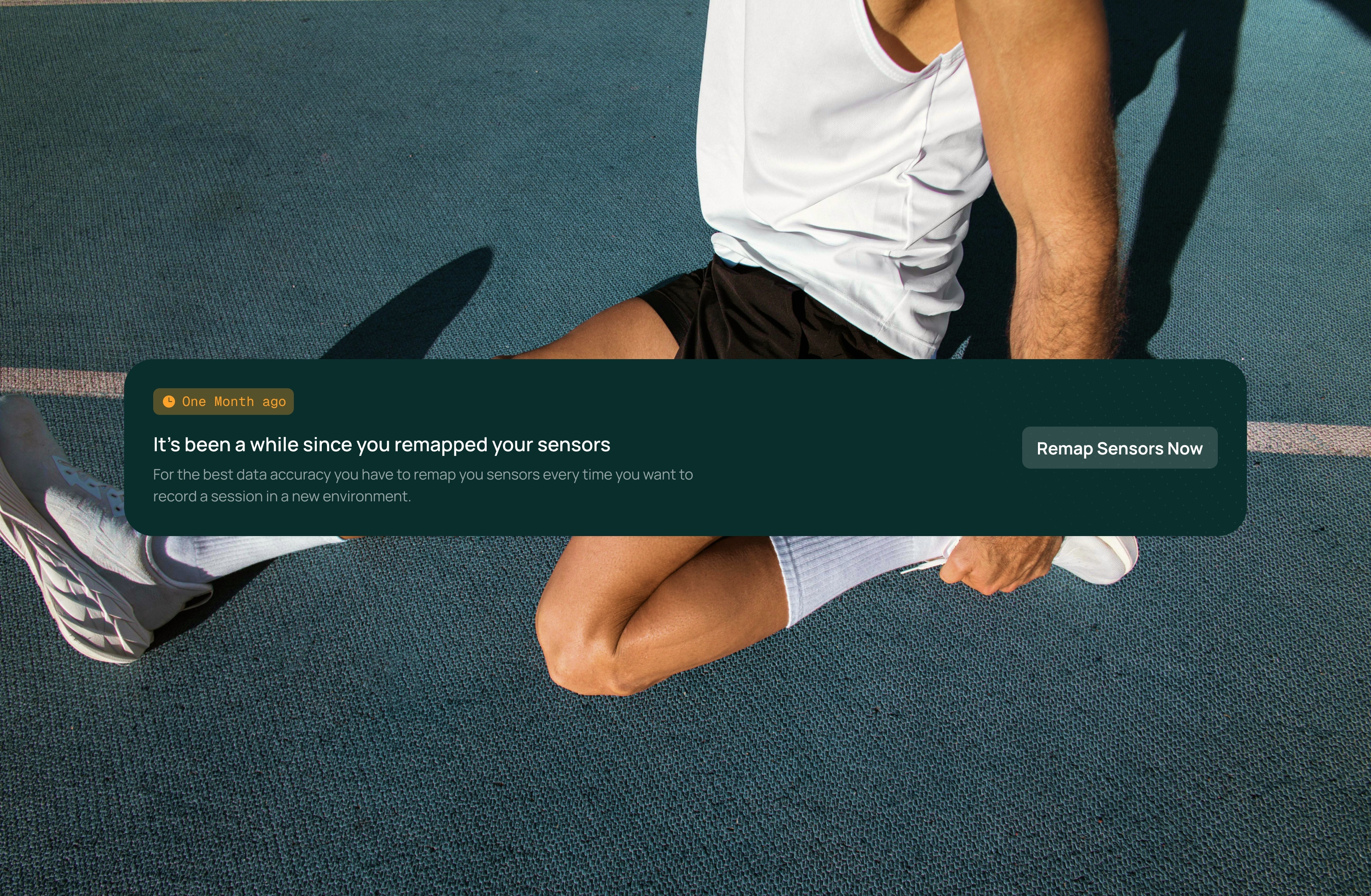
The product only delivers value when users complete sessions, so friction here becomes churn risk and weakens proof of impact. We treated the experience as a completion problem: reduce decision load, make next steps obvious, and remove moments where users have to interpret the system while they’re trying to do physical work. Because the platform depends on body-worn sensors, hardware constraints were a first-class input and the flows had to stay clear across real-world setups, not only ideal conditions.
Built for real-world hardware constraints
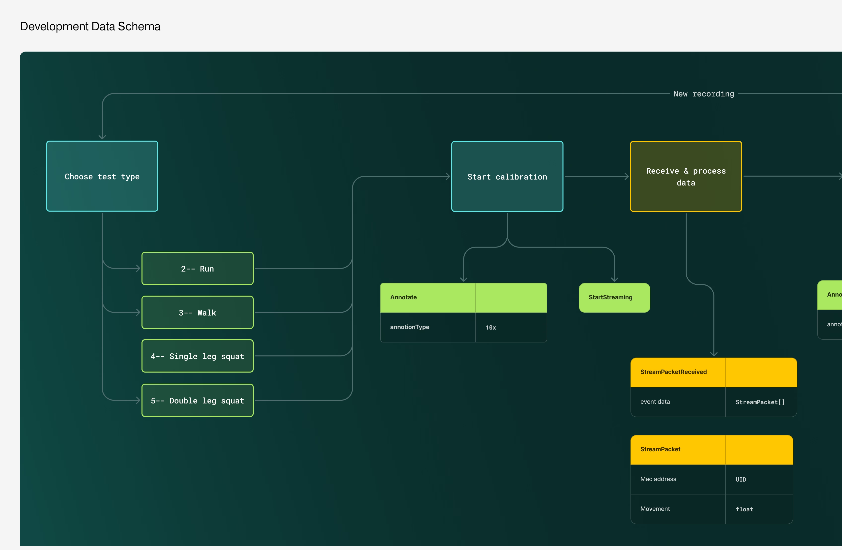
Design and development mapped the full data flow together early, so UX decisions matched what the system could reliably support. The platform is built in Ionic, in line with ORYX's existing setup and investment. To enable hardware integration, we used native Swift development to connect the sensor SDK with the iPad app. This ensured stable data transfer where cross-platform solutions fall short. By combining Ionic with native Swift where it matters, the platform supports both hub and no-hub setups and can evolve without introducing reliability risk.
A scalable core for a hardware-enabled platform
ORYX can’t evolve like a typical SaaS product because reliability carries more weight when hardware is involved. Every future feature has to be introduced without destabilizing the parts clinicians, teams, and athletes depend on.
We focused on a modular, testable foundation so new capabilities can be added in controlled steps, which protects velocity as complexity grows. This setup reduces the cost of change and helps the team ship improvements without turning every release into a risk event.
From content to clarity
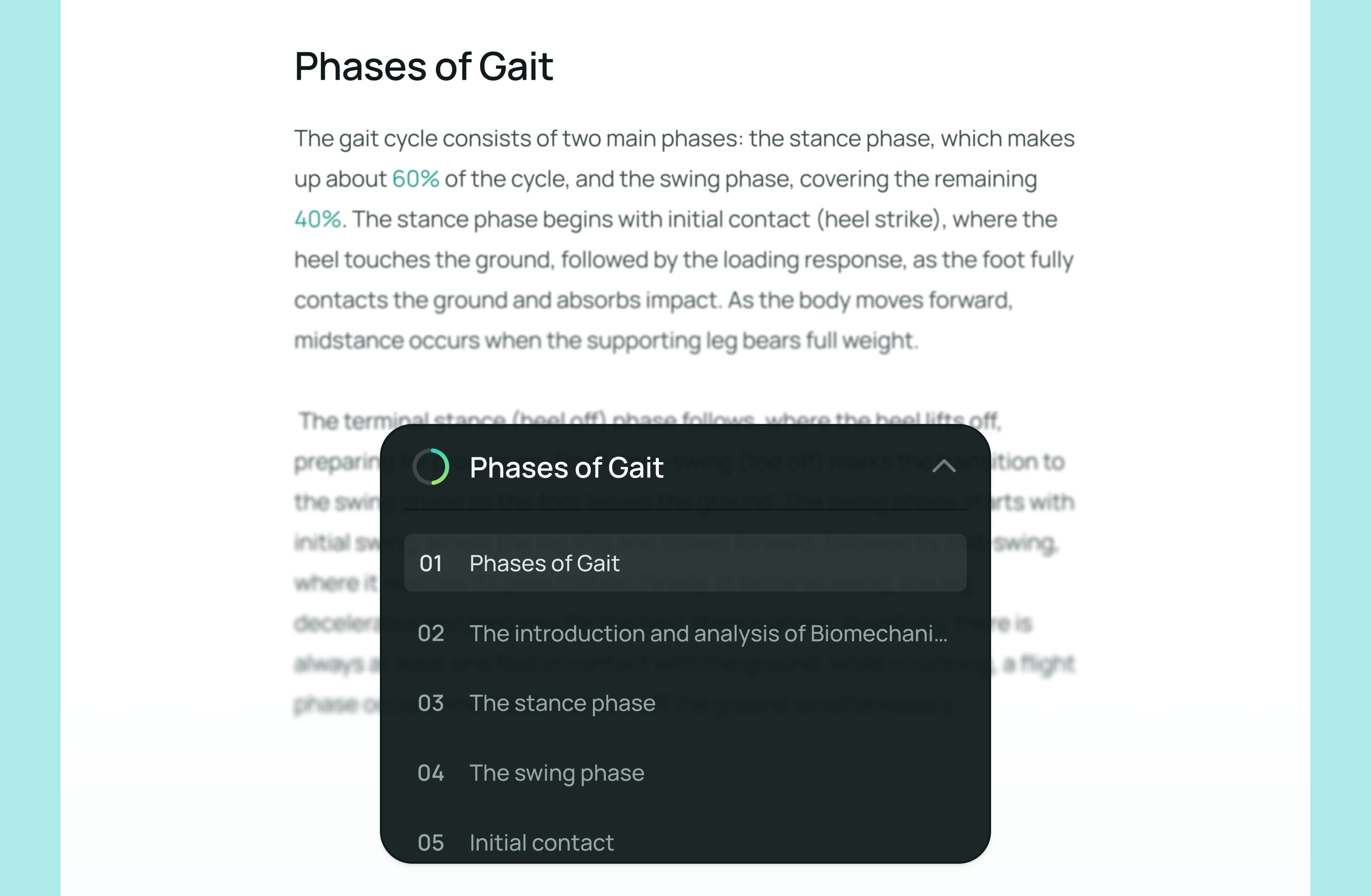
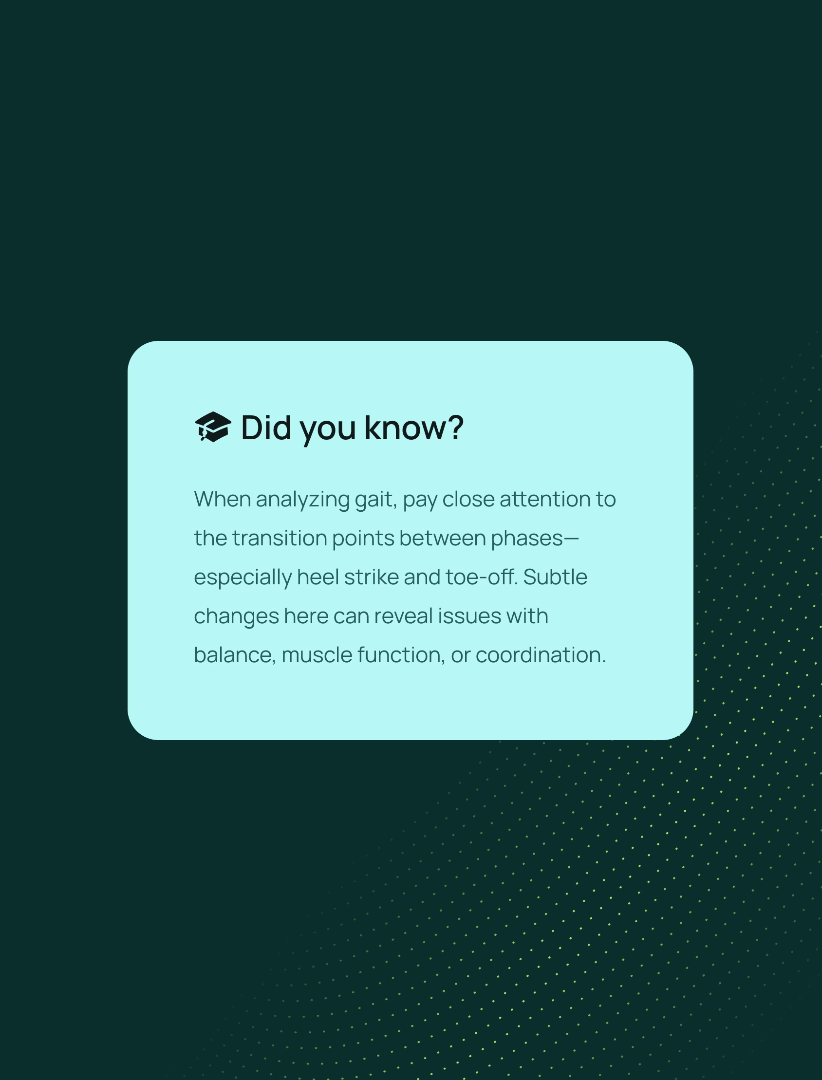
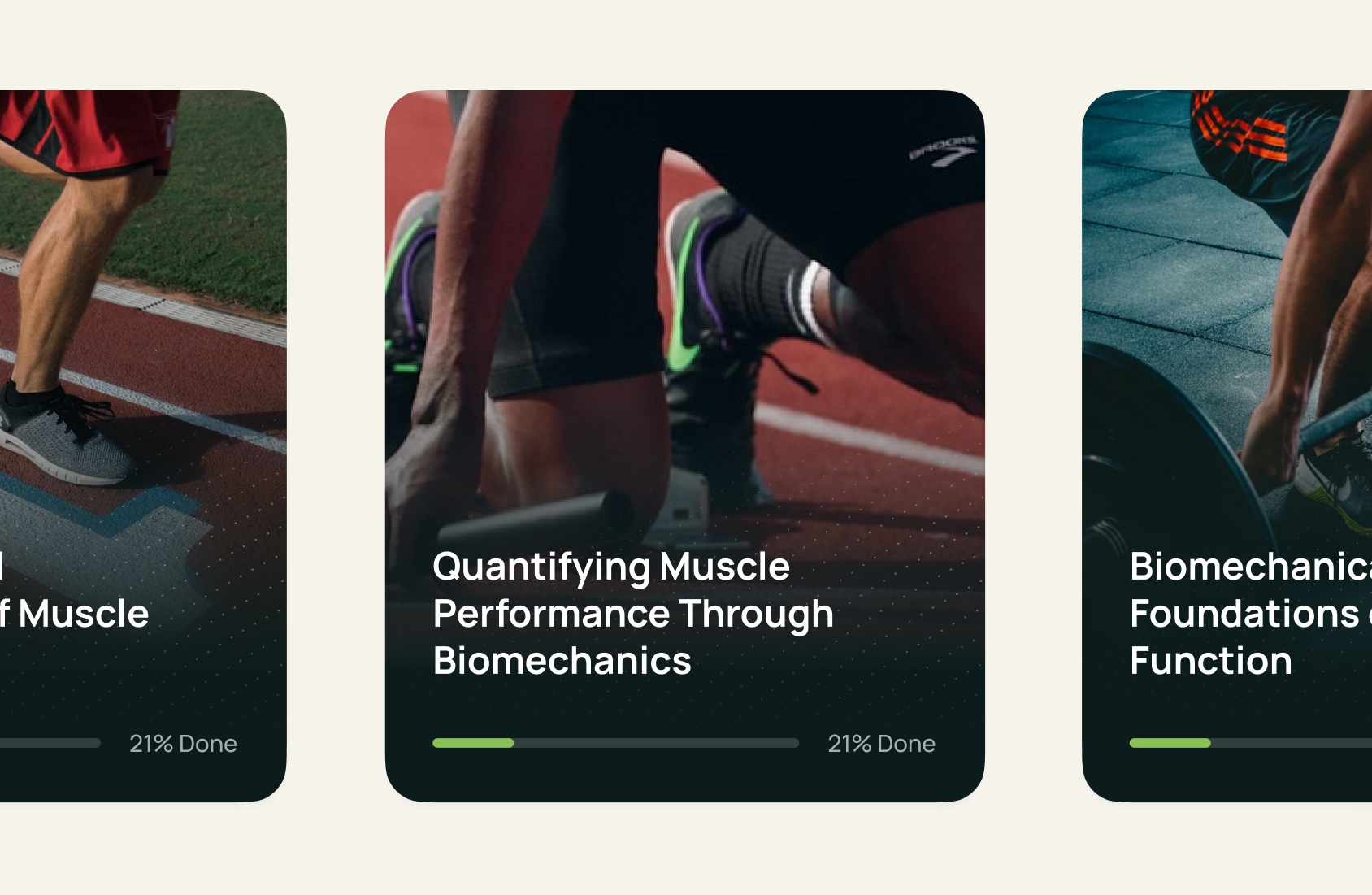
ORYX’s library of courses, articles, and videos is growing fast, and without structure it would become harder to navigate and harder to trust.
We worked with ORYX to define the information architecture early, aligned with development, so the knowledge base can be rolled out in a clear and scalable way. By putting this structure in place ahead of launch, the platform is ready to support users once the library goes live and continues to grow.

Bridging brand and product so trust carries through
In movement analytics, the brand is part of the trust system because users rely on data to make high-stakes decisions. If the product and messaging don’t feel consistent, credibility drops and differentiation becomes harder.
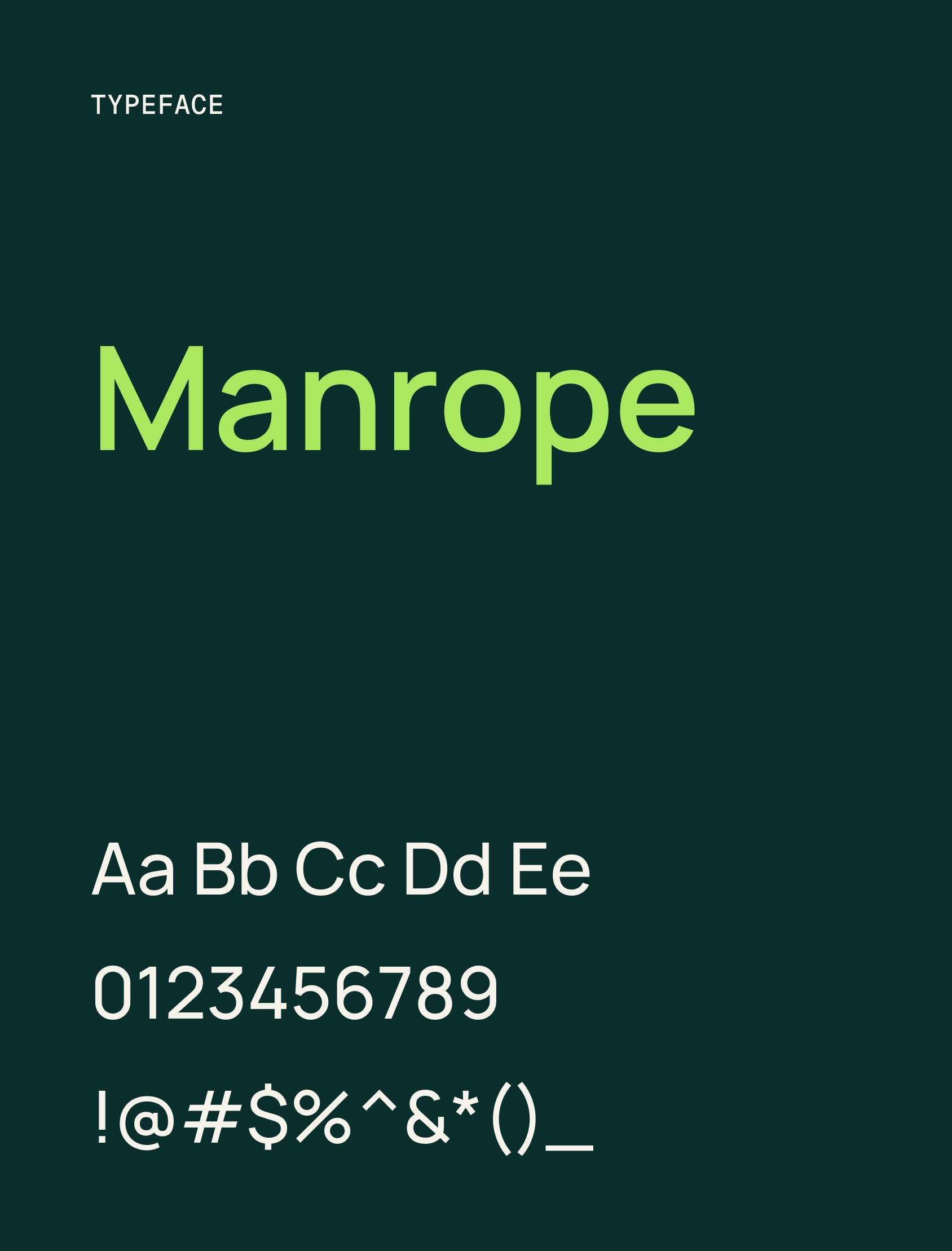
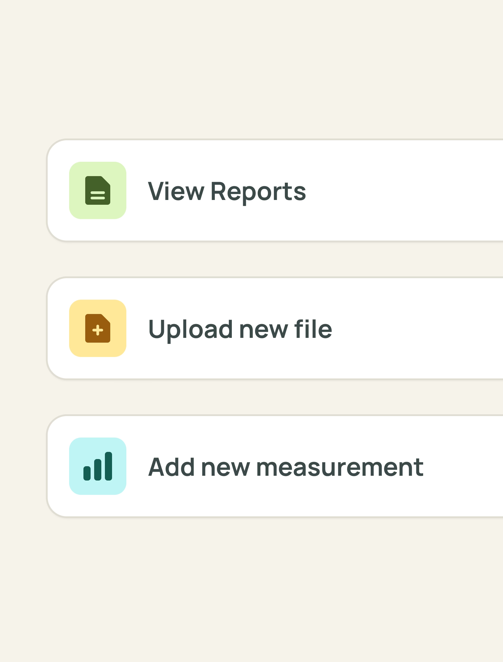
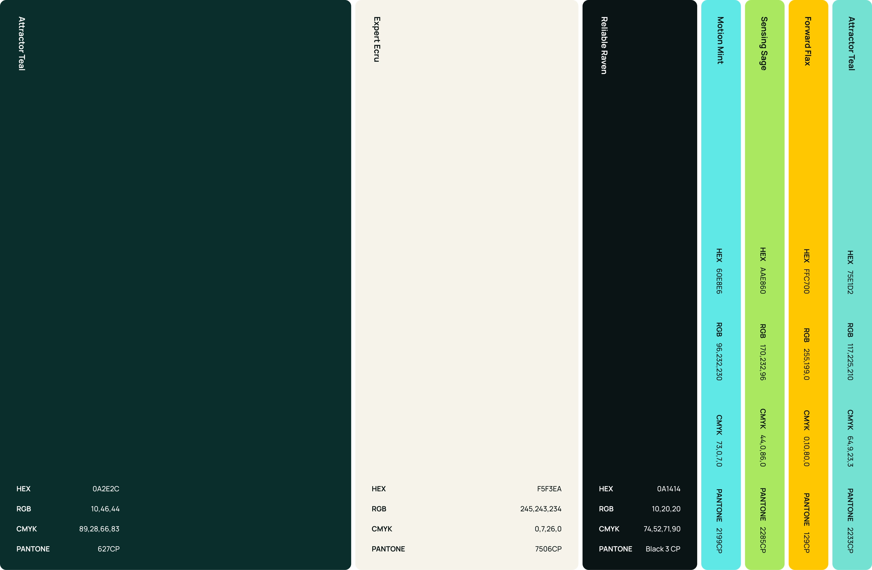
We translated the “connecting the dots” foundation into a coherent expression across touchpoints so ORYX shows up as one product, not separate pieces. This gives the team a clearer point of view in a crowded market and helps buyers understand the value faster.
Results: becoming an industry leader
The new platform reduces friction in session completion and makes it easier for users to find and use ORYX’s growing body of content. Under the hood, the modular, testable foundation supports both hub and no-hub setups, so the team can add features without destabilizing existing functionality. Combined with a clearer positioning, ORYX can differentiate with more confidence, build trust faster, and scale the product without compounding operational risk.

Our brand wasn’t aligned with our identity anymore. It needed a radical change and Yummygum made it happen. They acted on feedback, kept communication clear and to the point, and made the process smooth. Their no-nonsense approach made collaboration efficient and effective. The final result exceeded expectations, and we’re happy to collaborate ever since.

