Impierce
Impierce struggled to turn their purpose (building trust into every digital interaction) into a story that resonated with users and investors. Their brand identity lacked the authority to match their vision: allowing people and organizations to interact with confidence, privacy and ease.
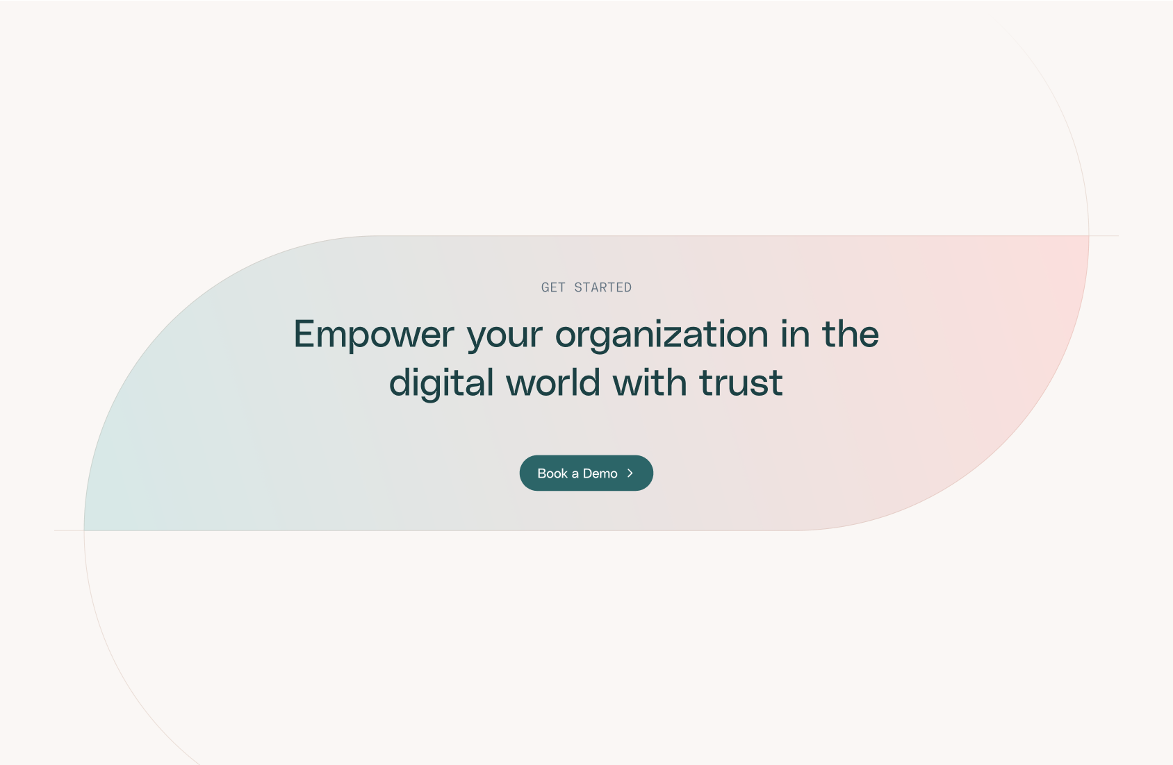
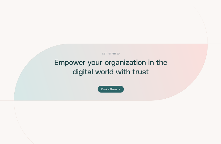
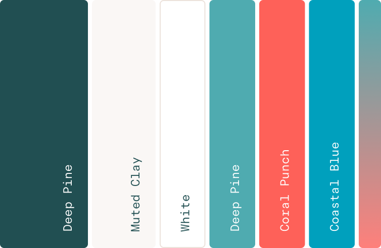
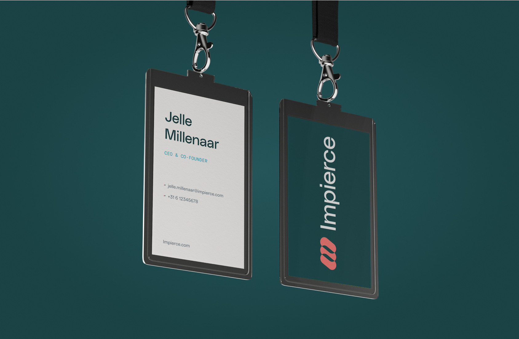
We developed a brand identity that places Impierce at the heart of every interaction: a logo symbolizing connection, gradients that capture interaction, and colors balancing reliability with innovation. Translated into their website, the new identity strengthens credibility with investors and makes their trust infrastructure software more accessible to individual users and organizations worldwide.
What we worked on
- Brand Strategy
- Knowledge Sharing
- User Research
- Information Architecture
- UX/UI Design
- Website Design
- Graphics & Illustrations
- Pitch Decks
- Brand Identity Guidelines
- Design System
- No-code Development
- Animations & Interactions
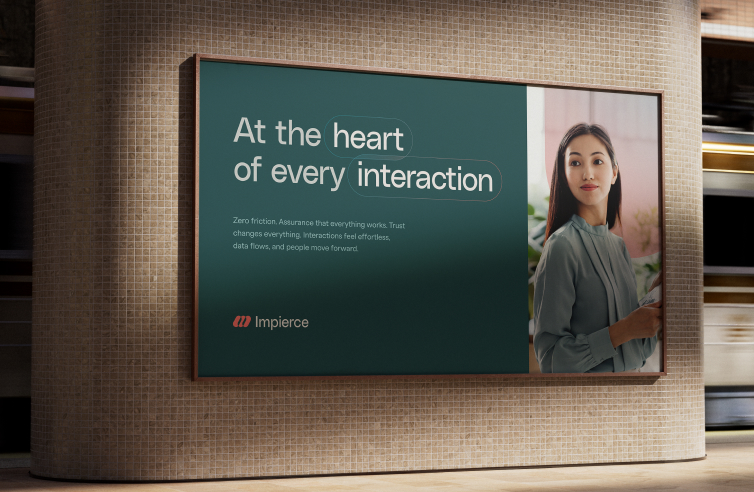
Impierce empowers individuals and organizations to navigate the digital world with confidence by embedding trust into every interaction. Their Self-Sovereign Identity (SSI) solutions streamline verification, credential issuance, and secure data sharing, enabling seamless onboarding, privacy, and compliance across ecosystems. They help businesses prevent fraud, ensure regulatory compliance, and deliver personalized experiences, while giving users control over their own digital identities.
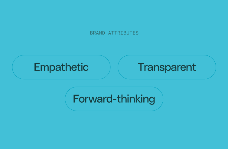
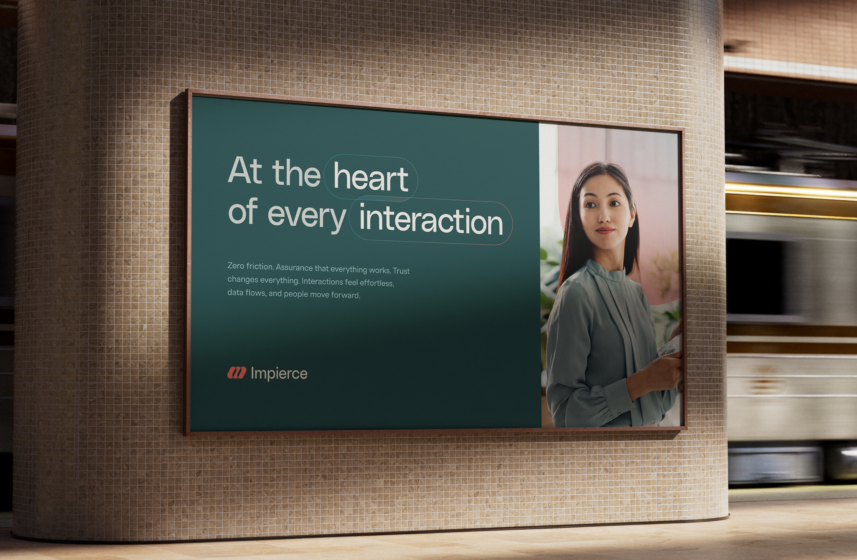
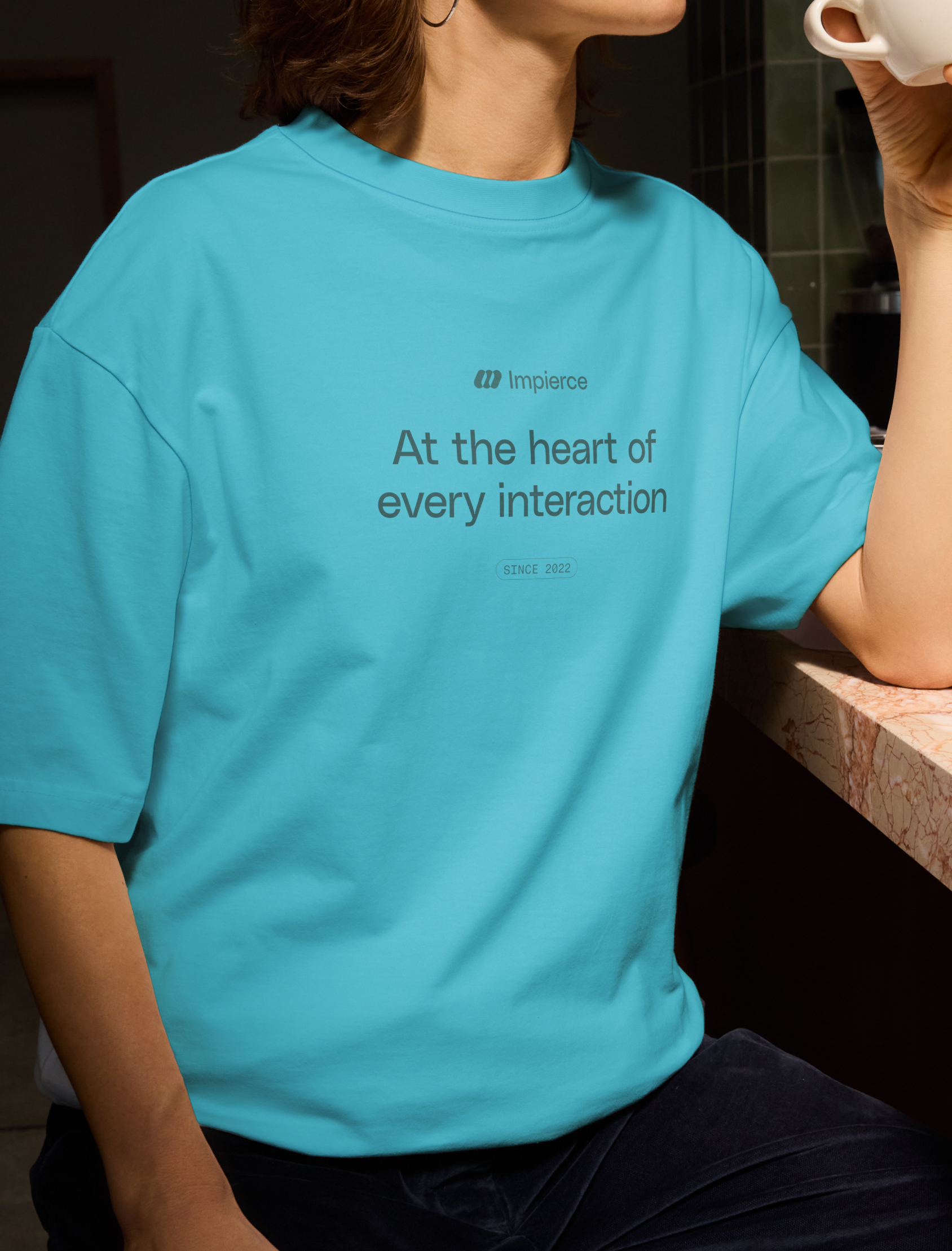
At the heart of every interaction
Impierce needed a brand strategy that clearly conveyed their role as a trusted enabler in the digital identity space. To uncover their values, audience, and personality, we ran a Brand Strategy workshop with the team. From this foundation, we shaped a brand identity built around the concept of “at the heart of every interaction.”
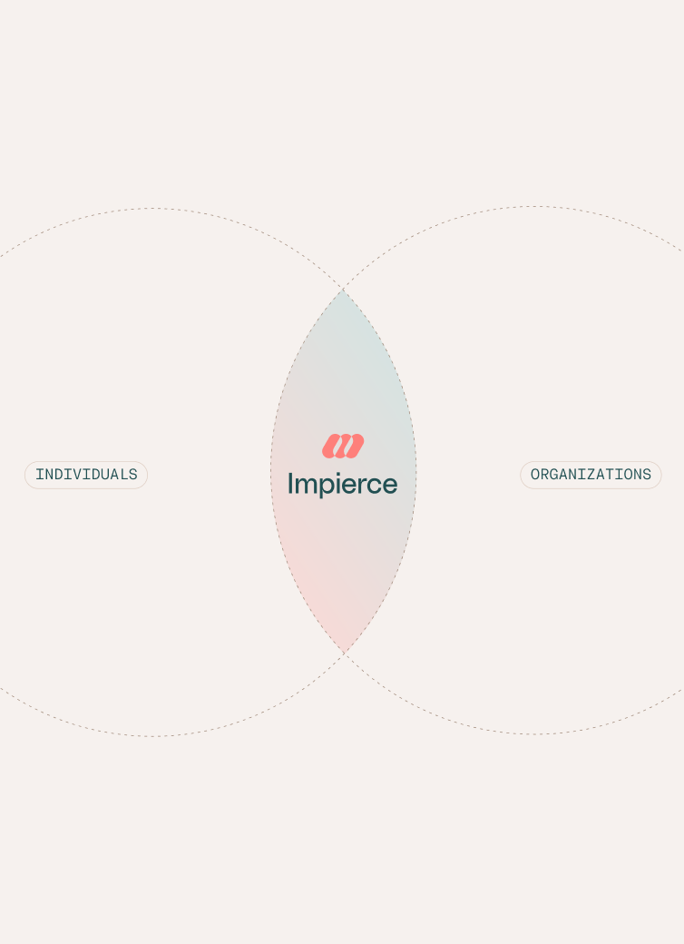
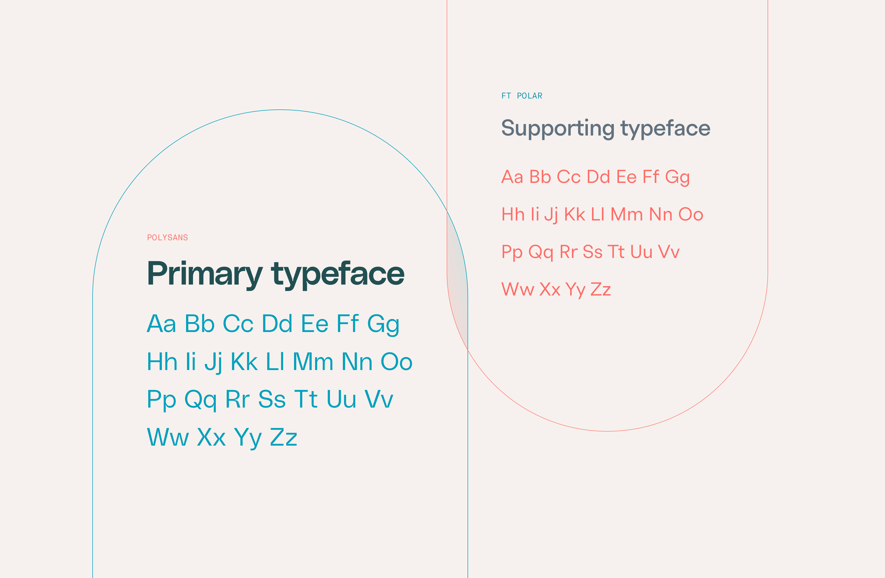
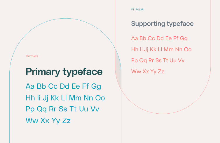
This concept reflects Impierce’s purpose and mission: wherever people and organizations meet, they act as the neutral core. Enabling privacy-first, high-quality exchanges that empower everyone to move forward with confidence. The identity emphasizes facilitation over control and highlights the overlap where trust is built. Every visual element, from patterns and gradients to colors and illustrations, reinforces the brand’s quality-driven, trustworthy values, making complex digital interactions feel clear, human, and reliable.


Creating the mark
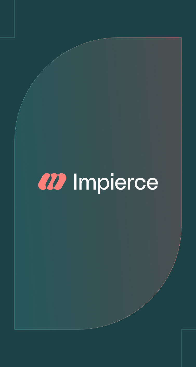
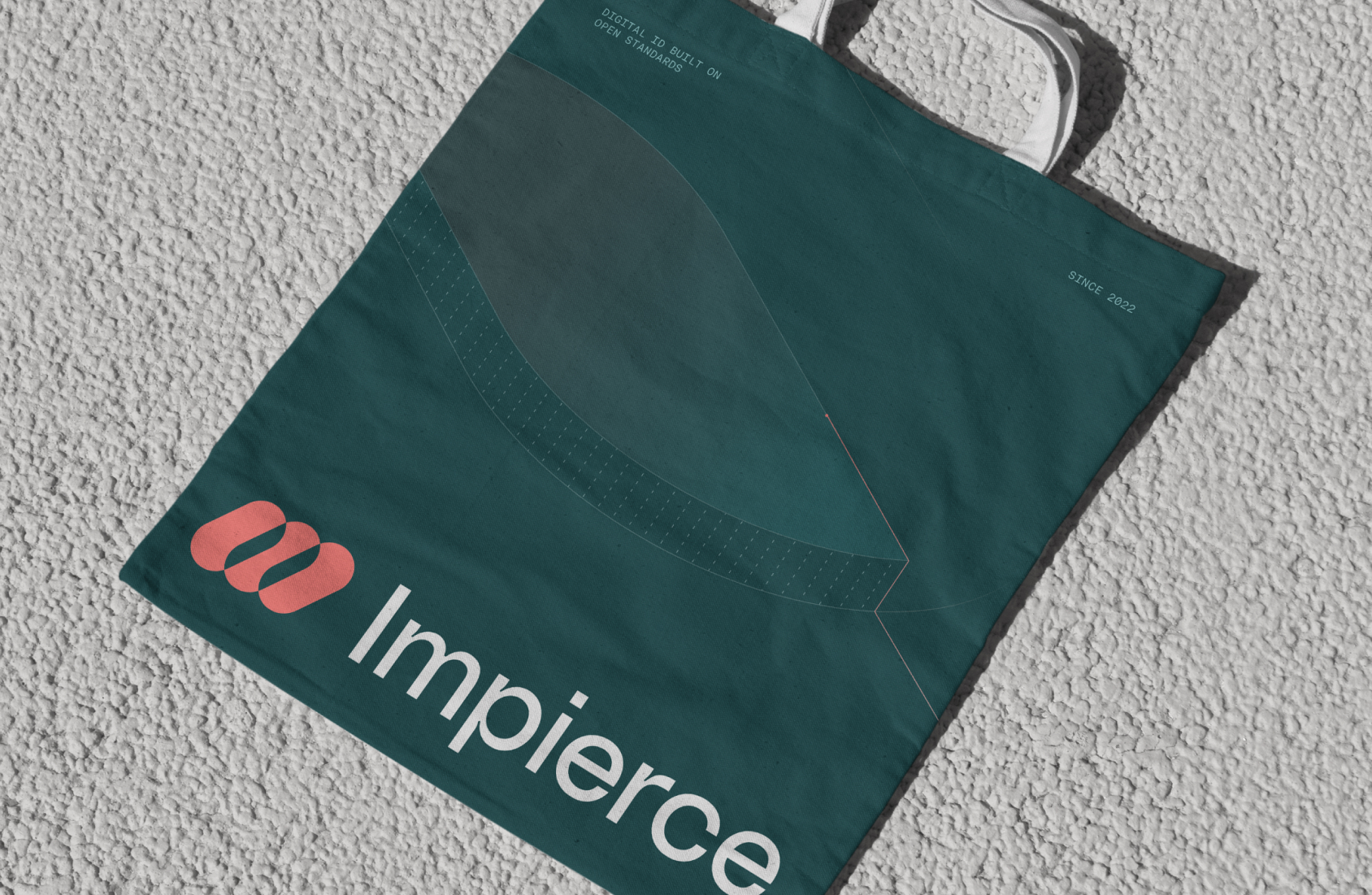
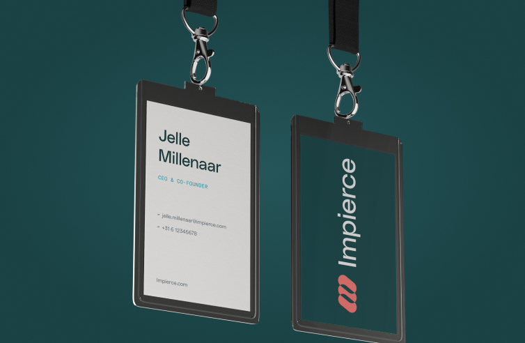
The Impierce logo embodies collaboration across domains. Connecting people, organizations and industries while nodding to the roles of holders, verifiers and issuers. Its forward leaning geometry captures a sense of movement and progress, reflecting Impierce’s drive to help others move forward with confidence. The overlapping forms are visible throughout the brand and are central to the story. Symbolizing how Impierce unites different parties and solutions within a single, trusted layer.
Patterns of trust
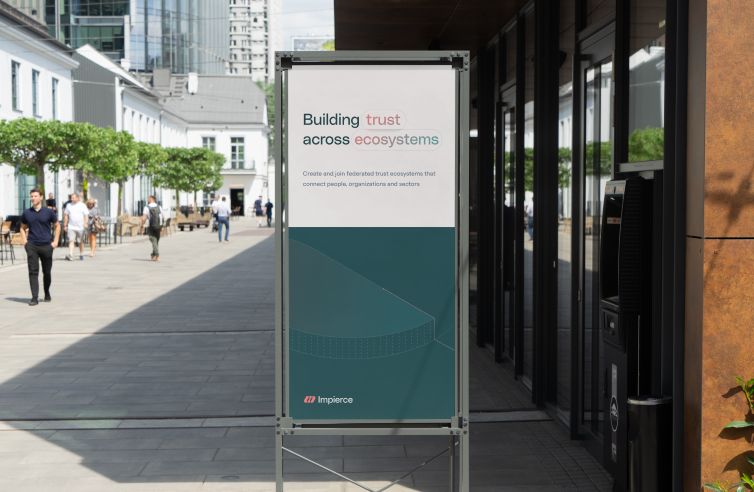
Impierce’s pattern system reflects its role as the connective layer at the heart of every interaction. Built around themes of structured flow, overlap, and dynamic relationships, the patterns visually represent how data moves: streamlined, secure, and purposeful. Repeating units and intersections mirror how Impierce enables trust with precision and composability, while adding a subtle, recognizable layer to the brand’s visual identity.
To streamline production, a pattern generator was created, making it easy for the team to generate new assets while adhering to the brand guidelines.

Designing the experience
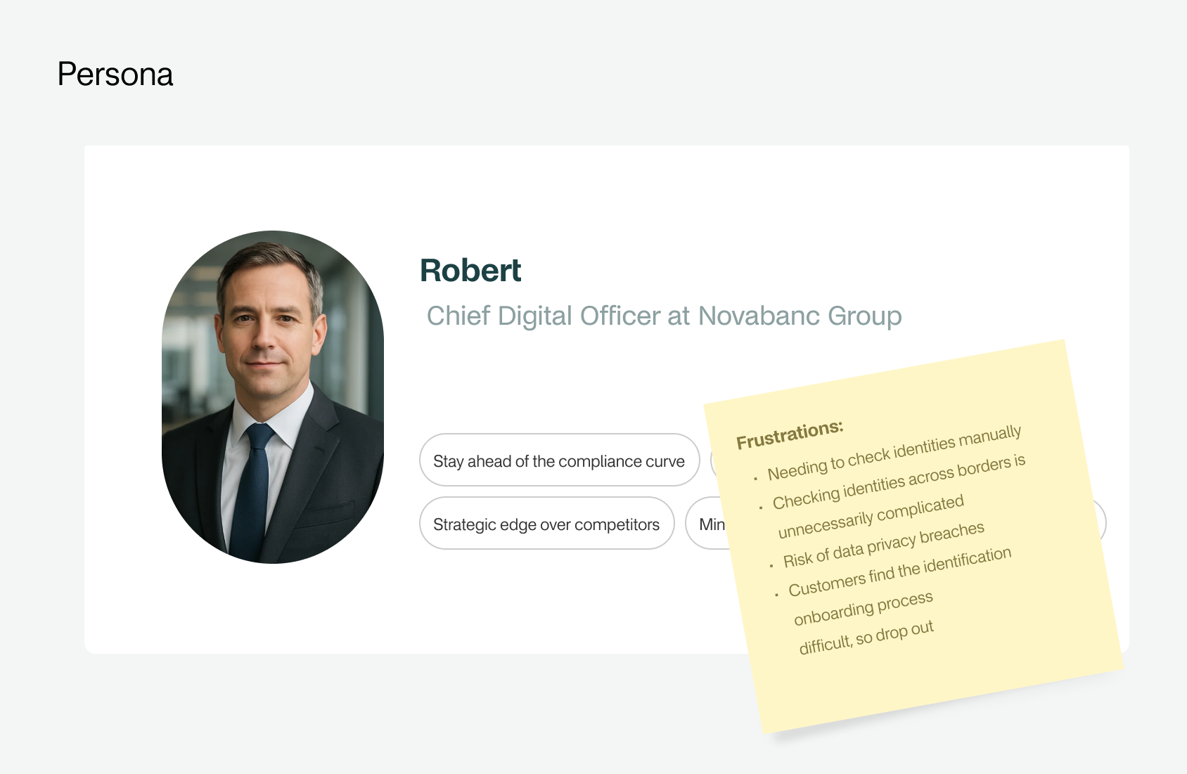
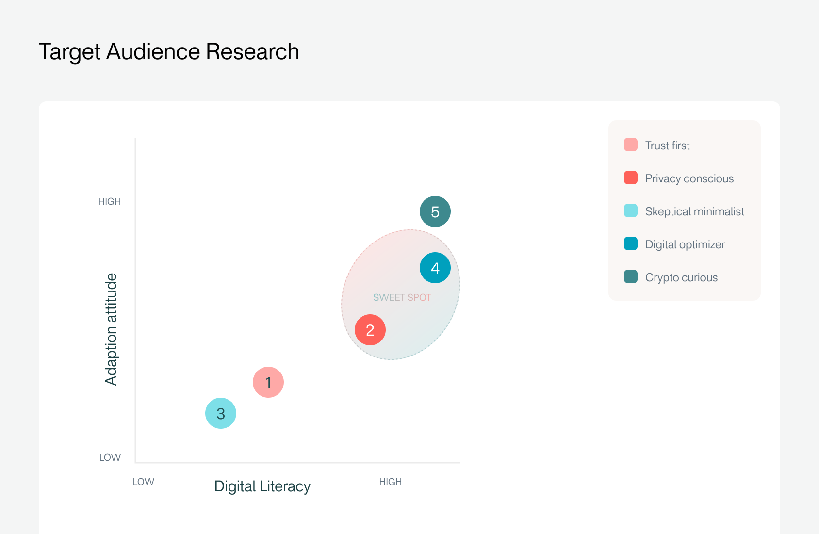
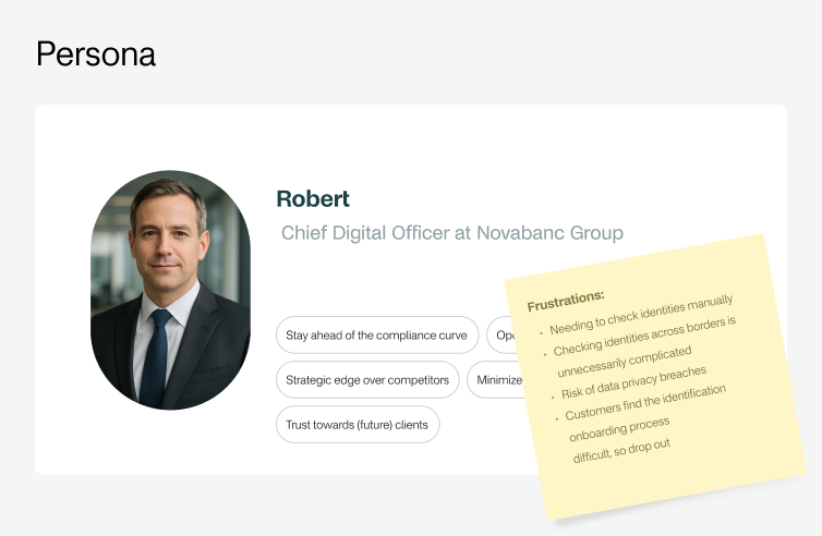
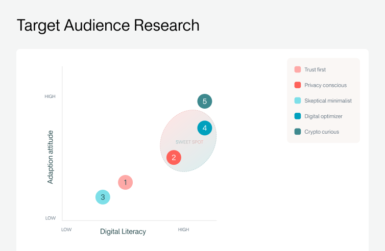
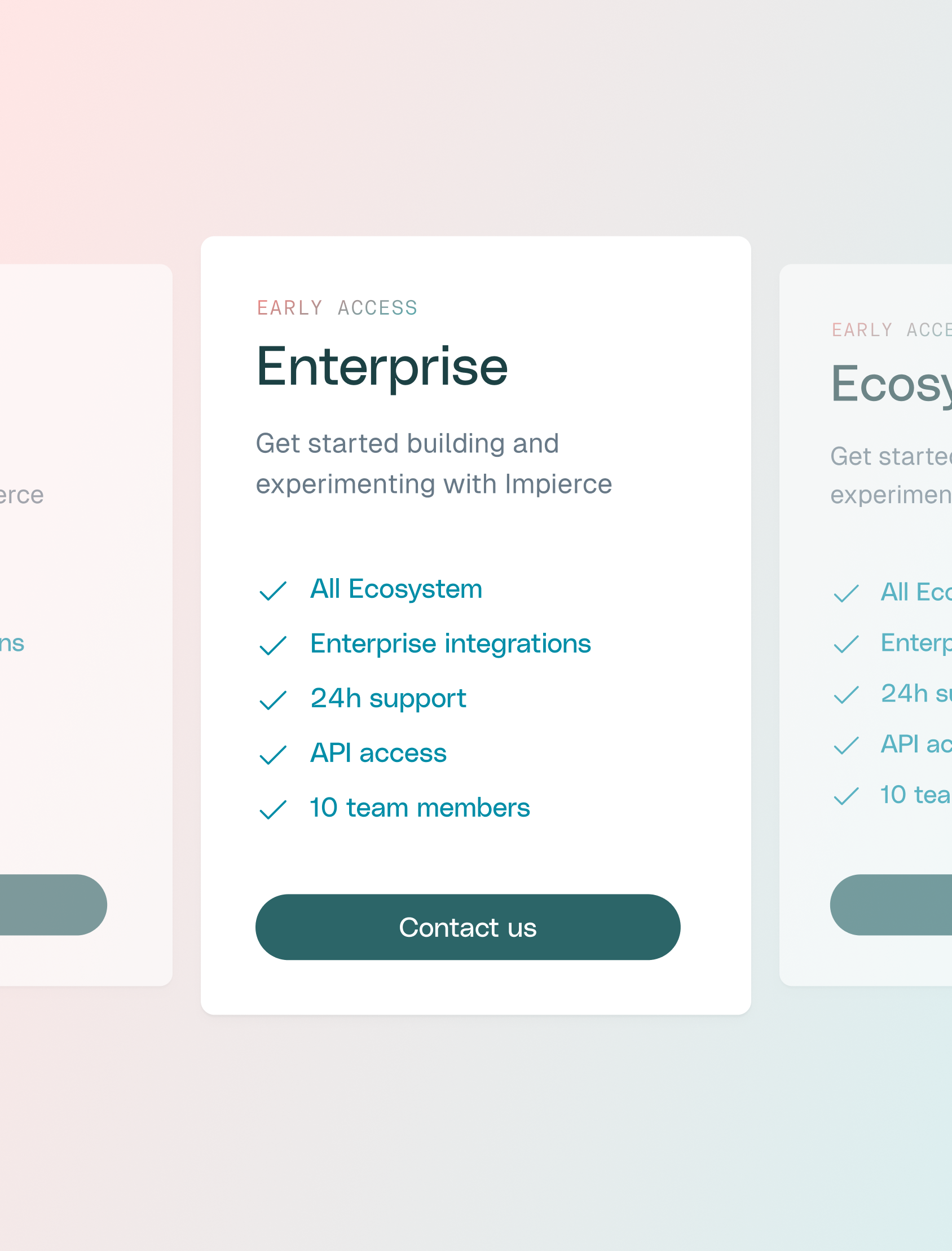
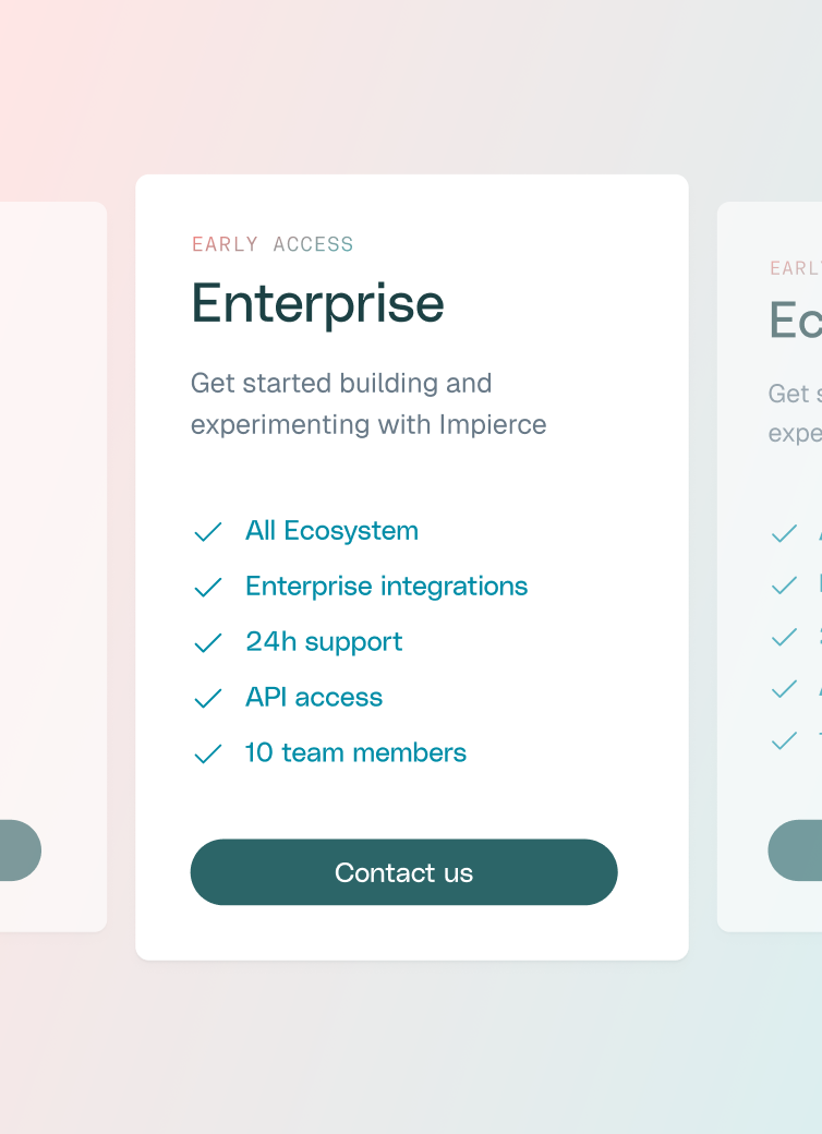
The website needed to communicate effectively to multiple audiences. Business professionals, technical experts, and EU citizens, while clarifying complex concepts like DIDs (Decentralized Identifiers) and VCs (Verifiable Credentials). Early research highlighted the importance of targeting decision-makers and potential advocates, such as CTOs, with messaging that balances technical accuracy and business value.
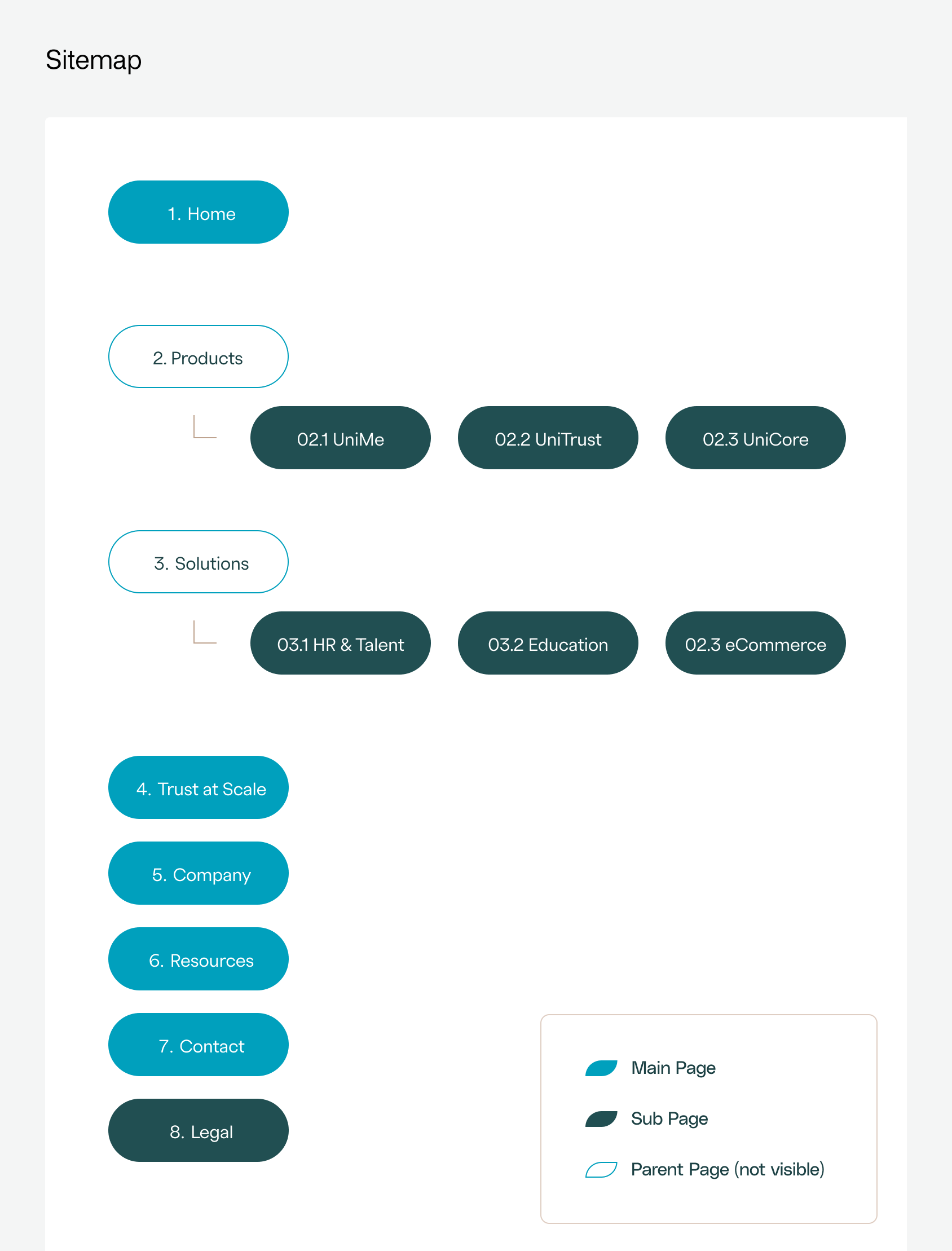
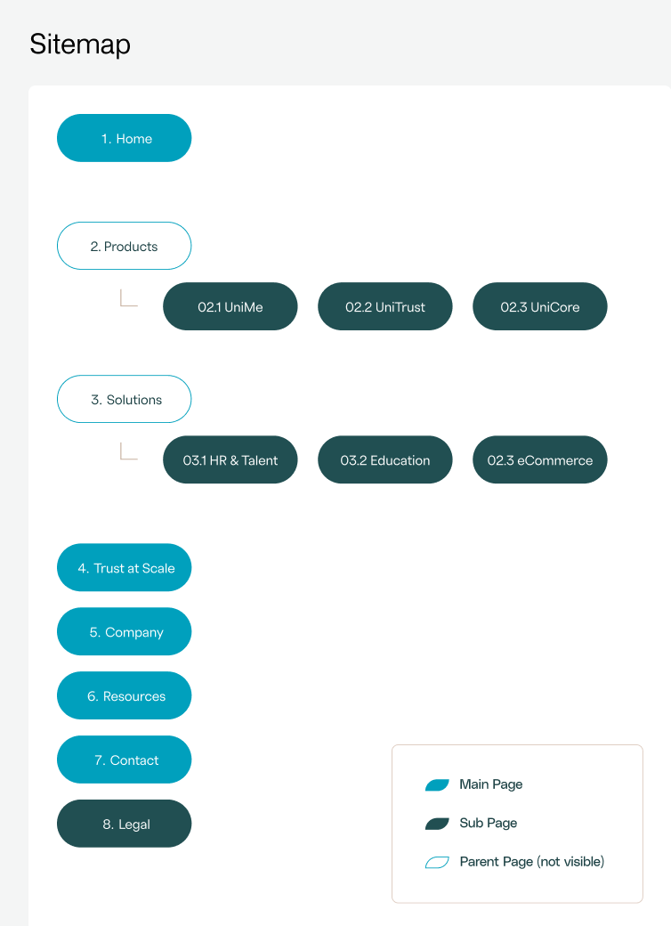
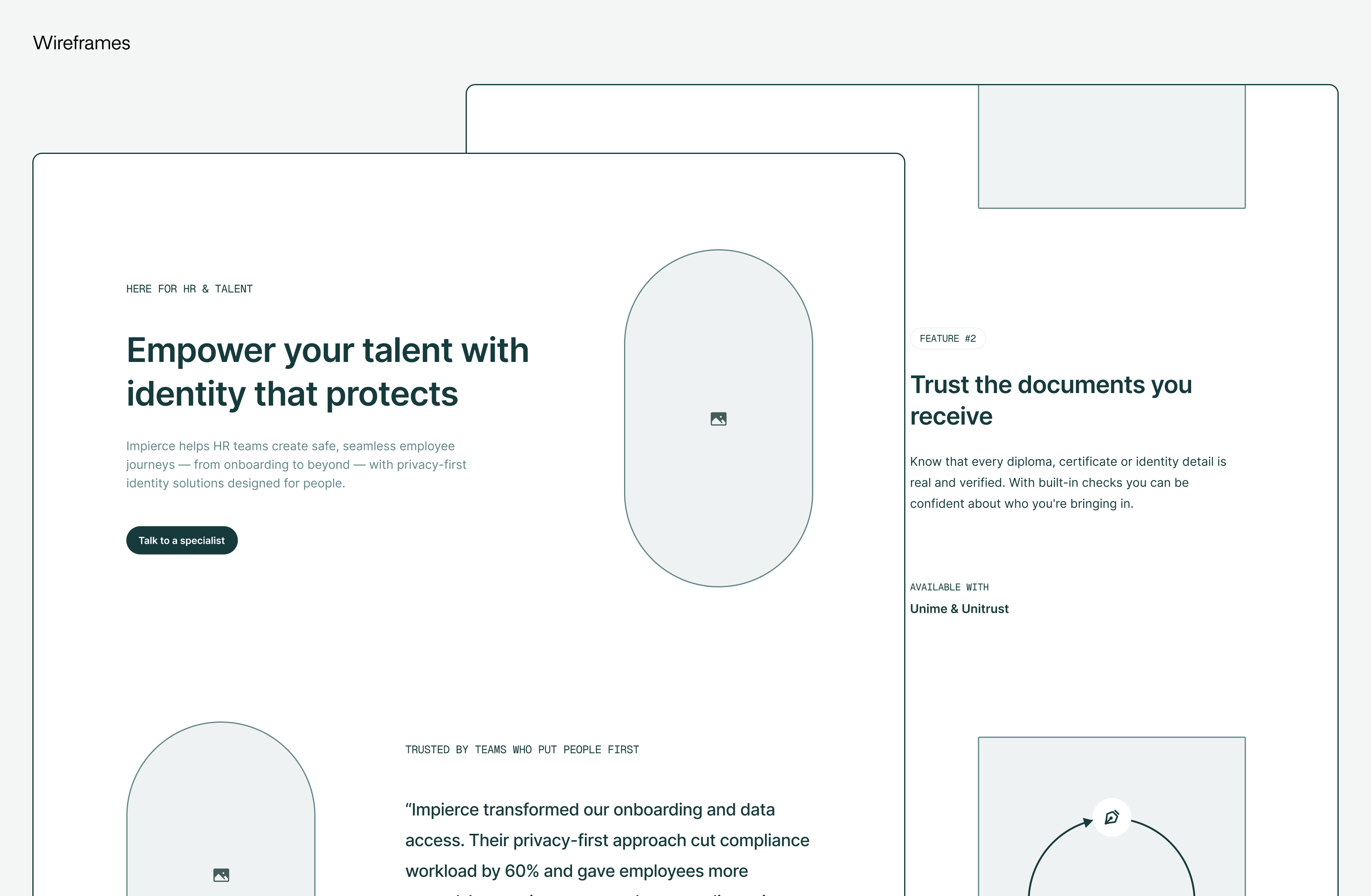
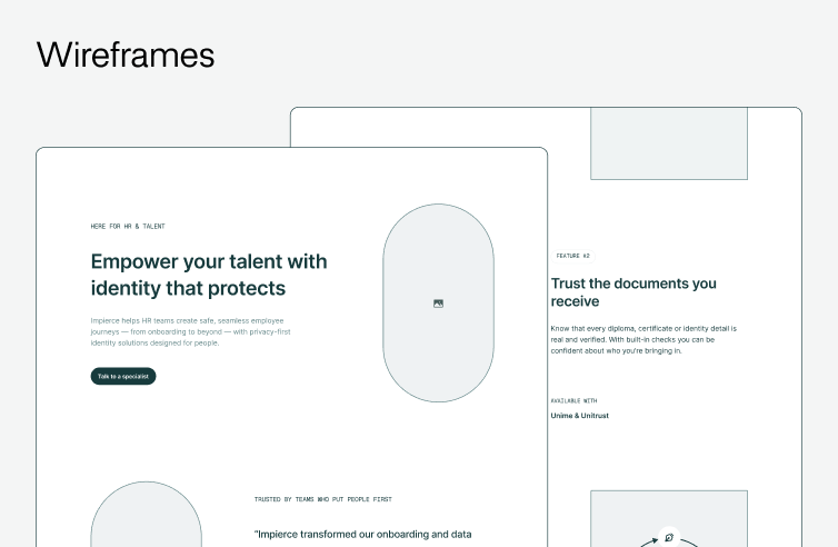
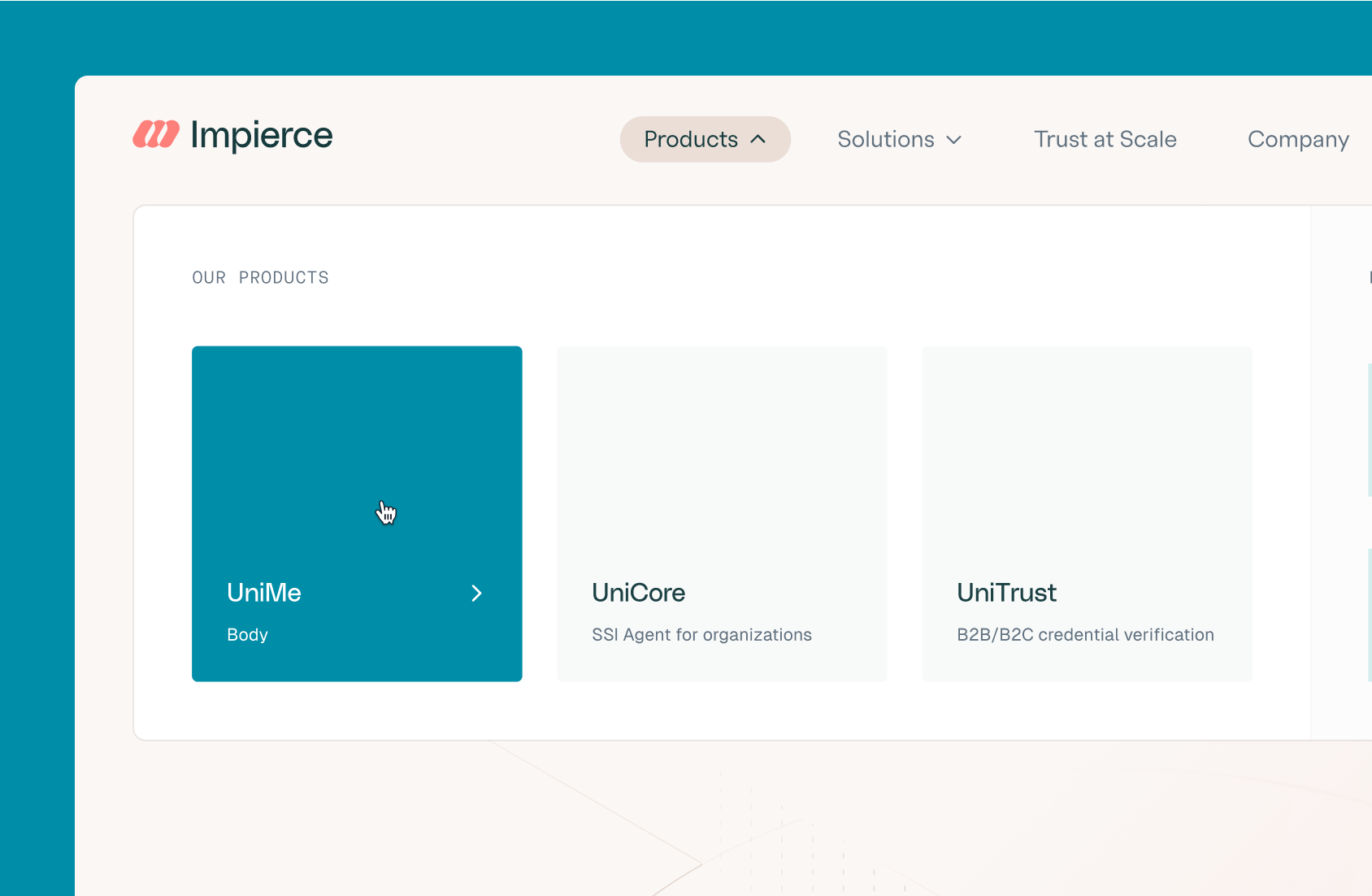
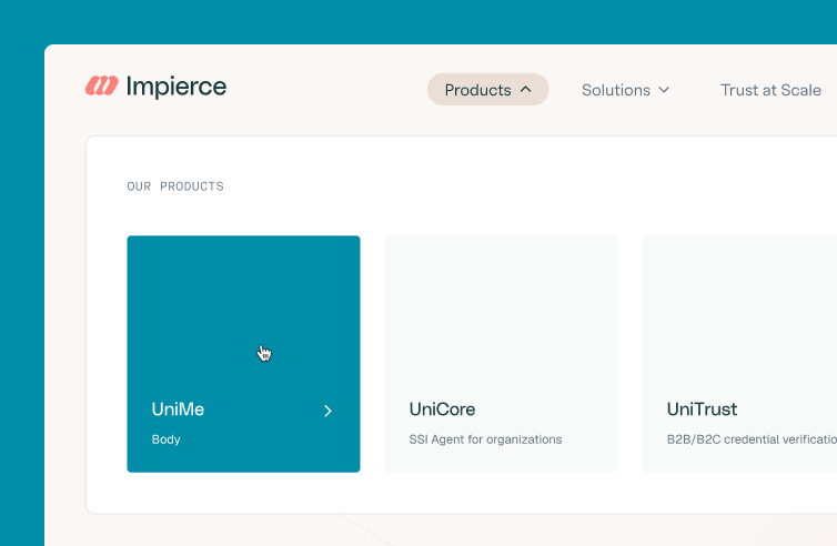
We established a three-tier information architecture: a high-level story of the trust ecosystem, product-specific details, and technical information for specific roles. Wireframes focused on clarity, showcasing products and ecosystems across industries while emphasizing trust-related features. A Dedicated trust at scale page highlights open standards, certified compliance, and privacy-first design, ensuring all audiences can quickly understand the benefits and integrity of Impierce’s solutions.


Clarity through visuals
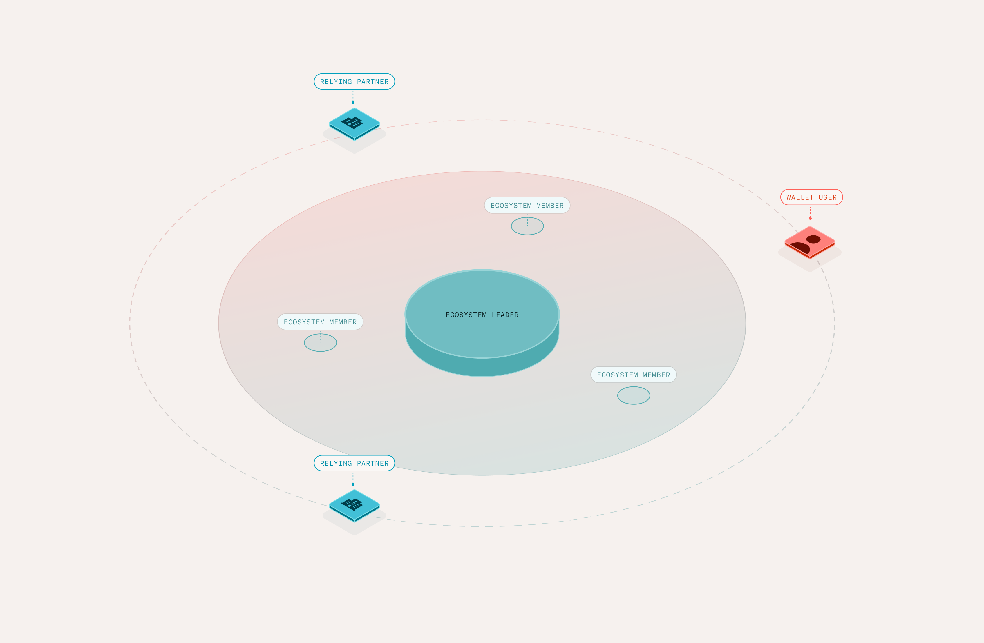
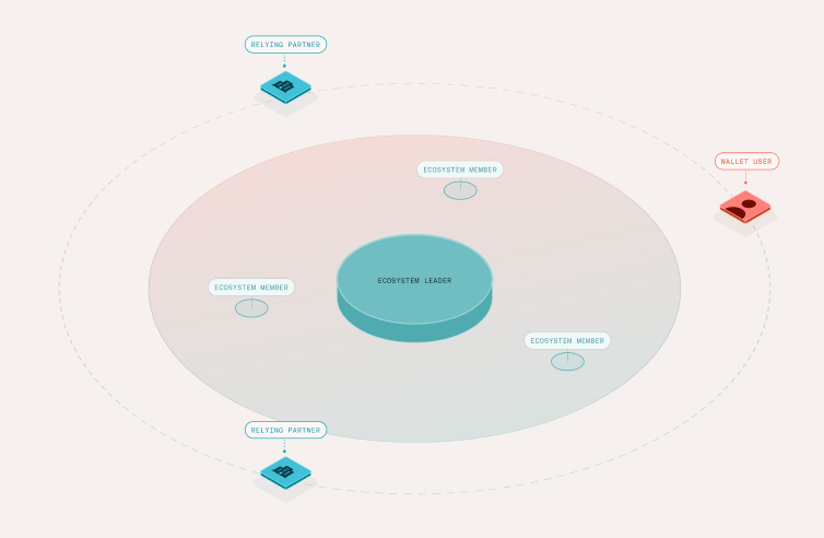
Illustrations were designed on an isometric grid to maintain a technical yet approachable look. Warm red tones are incorporated to soften the technical aesthetic, ensuring visuals feel human-centered while remaining flexible for light and dark backgrounds.
No-code, full speed
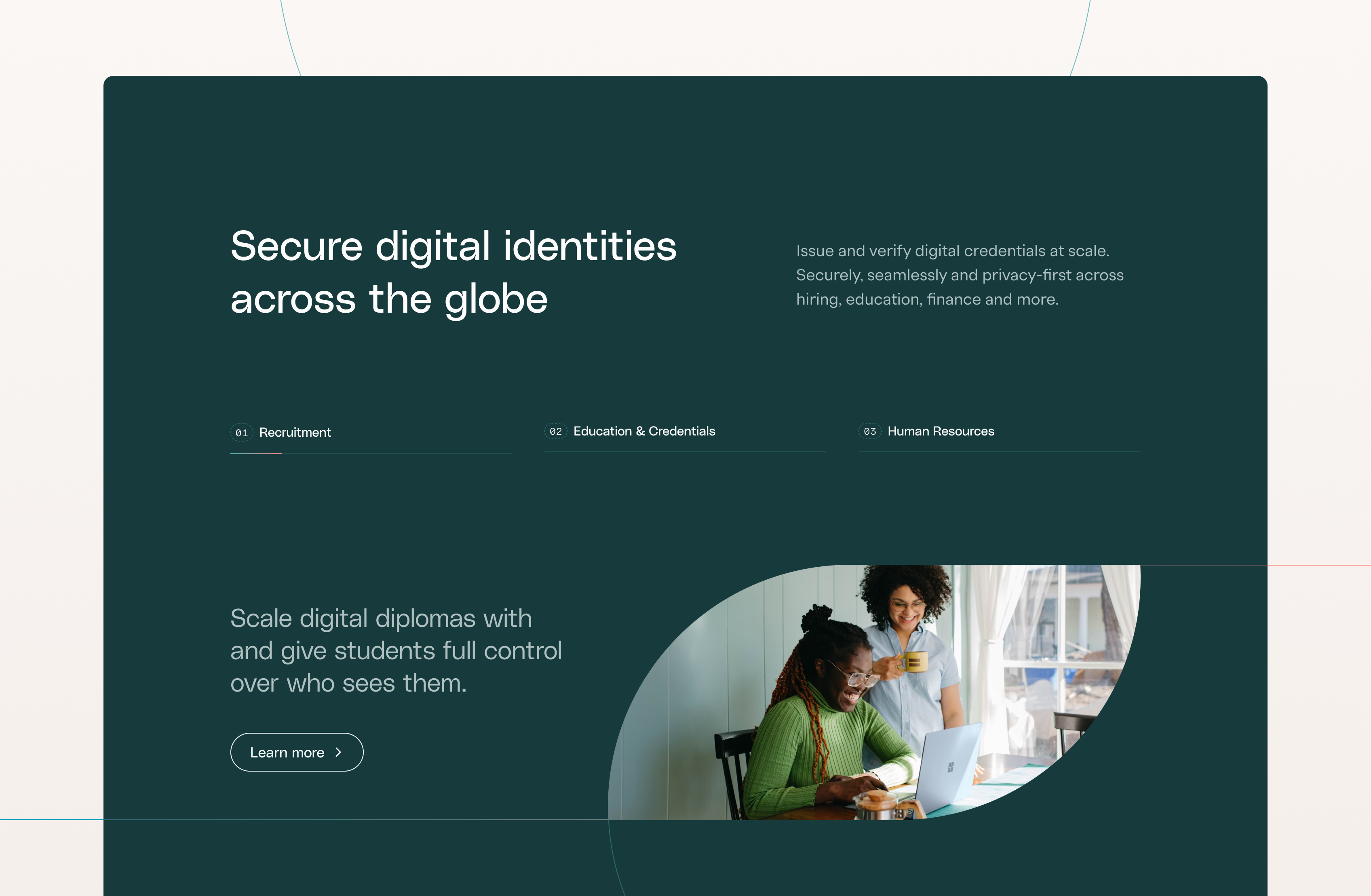
In close collaboration with Impierce, we chose Framer as their website platform. With few content updates expected, heavy custom code would have been overkill.
Framer makes it easy and cost-effective to add pages or make tweaks without developers, a perfect fit for their current scale-up phase. The trade-offs (like limited CMS features and platform lock-in) were clear, but together we decided speed, simplicity, and future-proof flexibility outweighed the downsides.
Results: scaling to their role
By reshaping Impierce’s brand, crafting a clear visual design system, and designing a website built for speed and simplicity, we helped them turn an abstract, highly technical proposition into a story that resonates. Their identity now signals authority and innovation, and their website is easier to evolve without developer overhead. Together, these foundations give Impierce the credibility and agility to scale their position at the center of Europe’s digital trust ecosystem.
We struggled to simplify complexity, translating business and technical concepts into a brand and website for a diverse audience. Yummygum immediately understood our world, offered advice and key insights, set a clear roadmap, and made collaboration seamless, often handling tasks beyond scope. We now have a trustworthy, relevant, visually engaging brand identity and website that sharpen our value proposition and inspire partners and stakeholders alike.
